Chart Properties
By default, the time-series data retrieved by the tsquery is displayed on its own chart, using a Line style chart, a default size, and a default minimum and maximum for the Y-axis. You can change the chart type, facet the data, set the chart scale and size, and set X- and Y-axis ranges.
Changing Scale
You can set the scale of the chart to linear, logarithmic, and power.
Changing Dimensions
You can change the size of your charts by modifying the values in the Dimension fields. They change in 50-pixel increments when you click the up or down arrows, and you can type values in as long as they are multiples of 50. If you have multiple charts, depending on the dimensions you specify and the size of your browser window, your charts may appear in rows of multiple charts. If the Resize Proportionally checkbox is checked, you can modify one dimension and the other will be modified automatically to maintain the chart's width and height proportions.
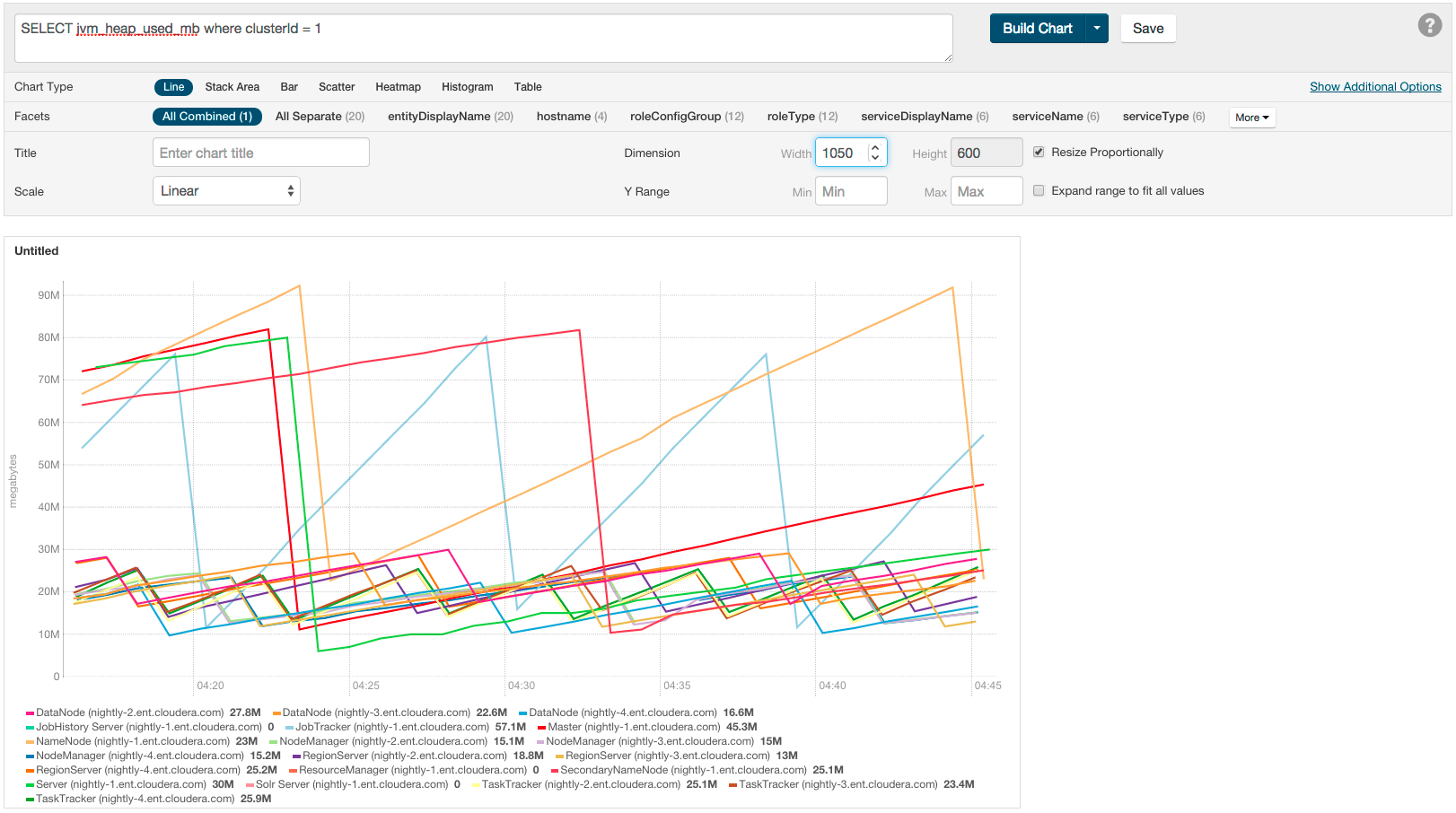
Changing Axes
You can change the Y-axis range using the Y Range minimum and maximum fields.
The X-axis is based on clock time, and by default shows the last hour
of data. You can use the Time Range Selector or a duration link (  ) to set
the time range.
) to set
the time range.