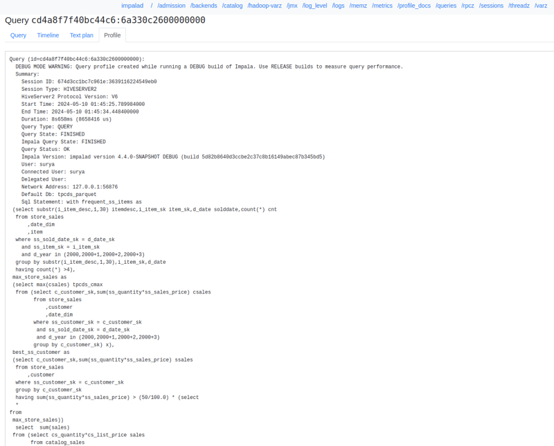
The Impala WebUI provides visual performance tools that track query execution, monitor
runtime metrics, and correlate cluster resource usage to help you isolate database
bottlenecks.
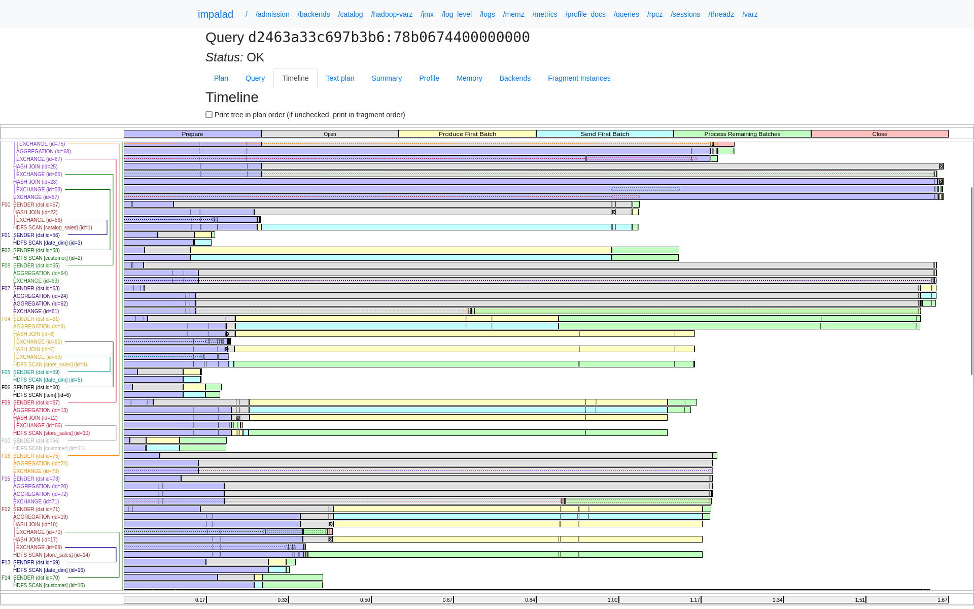
Analyzing query performance by using the timeline
For a detailed report on how a query was run and to understand its performance
characteristics, you can use the Gantt chart in the built-in WebUI. This chart is an
alternative to the profile command and renders timing information and
dependencies graphically.
The Gantt chart supports the following analysis capabilities:
Determining time consumption — Use the chart to identify where queries are spending time
instead of searching through text-based profiles.
Drilling down: After you identify which fragments or operators consume the most time, you
might need to check the summary or full profile for more detail.
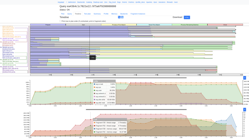
The following image shows the Gantt chart for the query timeline of a TPC-DS query:Figure 1. Query timeline in Impala WebUI
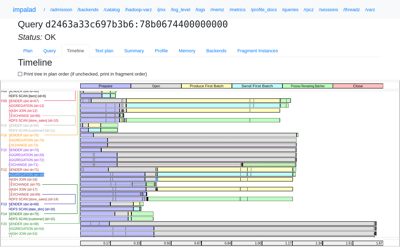
Visualizing fragment and node execution
The query timeline provides a visual representation of query fragments and plan node timings
in a compact format.
Tree visualization: The chart displays the plan and fragment tree on the left with
corresponding timing bars on the right.
Color coding — Plan node labels are color-coded by fragment for easy identification.
Phase tracking — Each colored block represents the longest time spent on a task. Tasks
that complete earlier are displayed as grey lines.Figure 2. Visual representation of query fragments
Join and exchange indicators — Dotted boxes for exchange nodes display when data rows are
sent, while specific symbols indicate when joined data arrives.
Flexible ordering: You can use the checkbox to change the node order to match the plan
order used in the Summary tab.
Automatic updates: If a query is still running, the timeline reloads every second to
provide the latest progress updates.
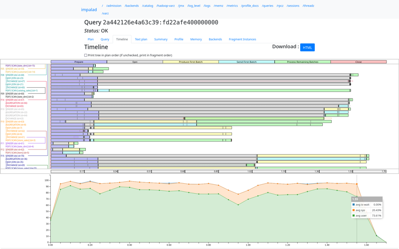
Correlating resource and utilization metrics
The WebUI provides detailed resource metrics to help you identify hardware bottlenecks
directly from the timeline.
CPU utilization tracking
You can view a stacked area chart that displays aggregate CPU performance across different
nodes throughout a query.
Metric types: The chart tracks host CPU utilization for user, system, and iowait
percentages.
Data alignment: Utilization samples align with the fragment timing diagram to help you
correlate resource usage with specific query parts.
Resource tracing: The RESOURCE_TRACE_RATIO query option determines the
utilization values tracked within the runtime profile.
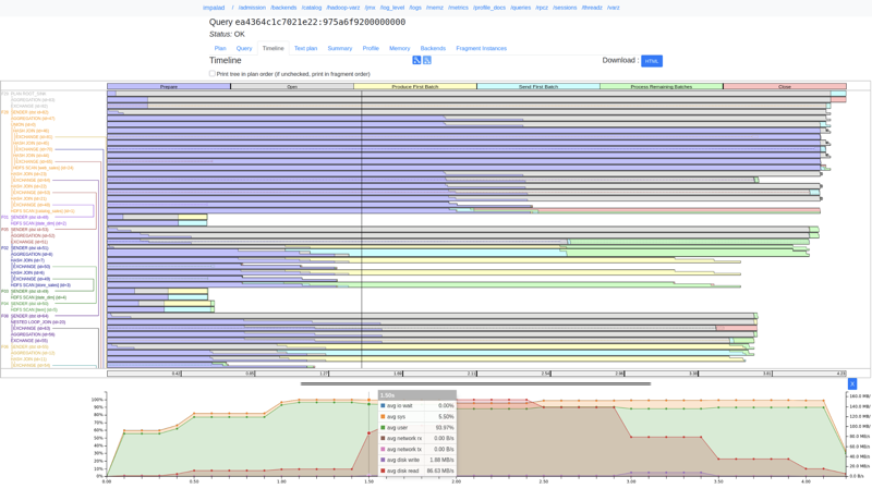
Memory, disk, and network throughput
Fragment-level usage: Click any plan node to view the total memory and thread usage for
that specific fragment.
Host throughput: When resource tracing is enabled (using query option
RESOURCE_TRACE_RATIO=1), the timeline displays real-time disk read and
write speeds and network transmission rates.
Synchronized inspection: Hovering over the diagram displays a time-synced line across
all charts, with a tooltip showing exact timestamps and metric values.
Readable units: Memory values automatically scale to clear units such as megabytes or
gigabytes for better readability.
The following image shows the CPU utilization and resource metrics chart in the Impala WebUI:
Identifying instance-level skew
The WebUI helps you identify "skew," which occurs when specific tasks take significantly
longer than others, by using a histogram display.
Distribution histograms: For phases with more than five instances, the timeline groups
timestamps into divisions.
Visual density: The height of each rectangle shows how many instances fall into that time
range, while their width shows the maximum timestamp in each division making it easy to spot
outliers.
Skew tooltips: Hovering over a phase rectangle displays the number of tasks in that bucket
along with the minimum, maximum, and average time taken.
Example:
When a phase contains more than five instances, the timestamps are bucketed into five
divisions. Each division spans 20% of the difference between the maximum and minimum
timestamp values. The height of each rectangle is proportional to the number of instances in
that division. Hovering over a bucketed phase rectangle displays a tooltip that contains the
following details:
Number of instances
Maximum timestamp of the event in seconds
Minimum timestamp of the event in seconds
Average timestamp of the event in seconds
Additionally, this update minimizes the generation of SVG elements, which significantly
decreases browser rendering times for large query profiles.
You can use the following shortcuts while hovering over the timestamps list:
To increase the number of timestamps
Hold Shift + Mouse Wheel while hovering on the timestamps list.
To increase precision of all numbers in query timeline
Hold Alt + Shift + Mouse Wheel while hovering on the timestamps list.
The following histogram chart shows low instance-level skew across divisions:
The following histogram chart shows moderate variance and outlier distribution in query
execution:
The following histogram chart shows high instance-level skew with severe processing
outliers:
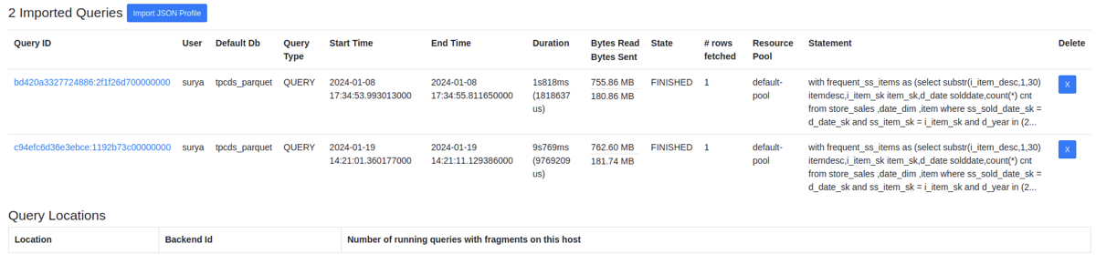
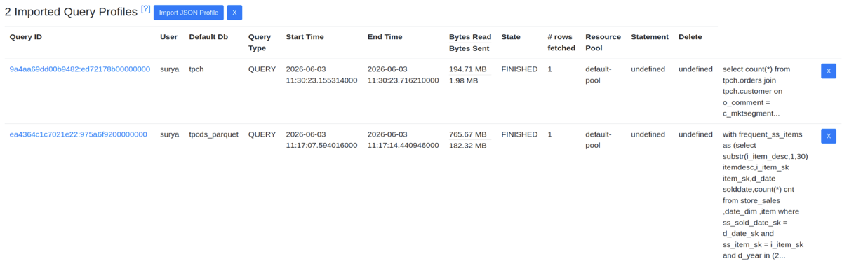
Managing and exporting query data
You can export query data for offline analysis or import historical profiles to troubleshoot
past issues.
Visual exports: You can export query plans and timelines as vectorized image files(SVGs
embedded within the HTML). These files include the unique query ID and allow you to scale the
diagram without losing quality.
Data imports: You can select and upload multiple profile files from your local computer at
once.
Local storage: Imported profiles are stored in your browser, allowing you to review a large
number of historical queries without re-uploading them.
Structured profile view: The query profile tab converts imported data into an organized
text format for better readability.
The following image shows the initial profile selection menu for data imports:
The following image shows the multi-file import progress tracking status:
The following image shows the visualization of an imported historical query profile:
Performance and interface maintenance
The WebUI has been updated to use modern web standards to improve performance and reliability.
Memory efficiency: Updated script standards reduce browser memory usage and prevent
technical conflicts within the interface.
Standardized naming: All internal labels and functions follow a consistent naming pattern
to make the interface easier to maintain and update.
Optimized rendering: The system groups multiple tasks together to significantly speed up
loading and rendering times, even for very large and complex queries.