Grouping (Faceting) Time Series
A time-series plot for a service, role, or host may actually be a composite of multiple individual time series. Using facets, you can combine time series based their attributes.
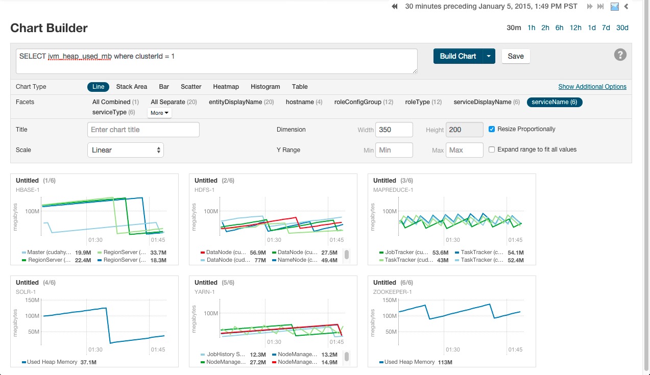
For example, the query SELECT
jvm_heap_used_mb where clusterId = 1 returns time-series data for the JVM heap
used. Each time series has hostname, role type, metric, and entity name attributes. By default
each attribute is displayed all on a single chart.
To change the organization of the chart data, click one of the facets in
the facet section in the upper part of the screen. The number in parentheses indicates how
many charts will be displayed for that facet. As shown in the image below if the serviceName facet is selected for the JVM
heap query, the time series is grouped into six charts, one chart each for each service name.
The charts for service types with multiple roles contain multiple lines (for example, HBase,
HDFS) while services that have only one role (for example, ZooKeeper) contain just a single
line. When a chart contains multiple lines, each entity is identified by a different color
line.