Changing the Chart Type
You can change a chart from one type to another.
- Click one of the chart types:
- Line - Displays the points in the time series as continuous line.
- Stack Area - Displays the points in the time series as continuous line and the area under the line filled in.
- Bar - Displays each the value of the metric averaged over a second as a bar.
- Scatter - Displays the points in the time series as dots.
-
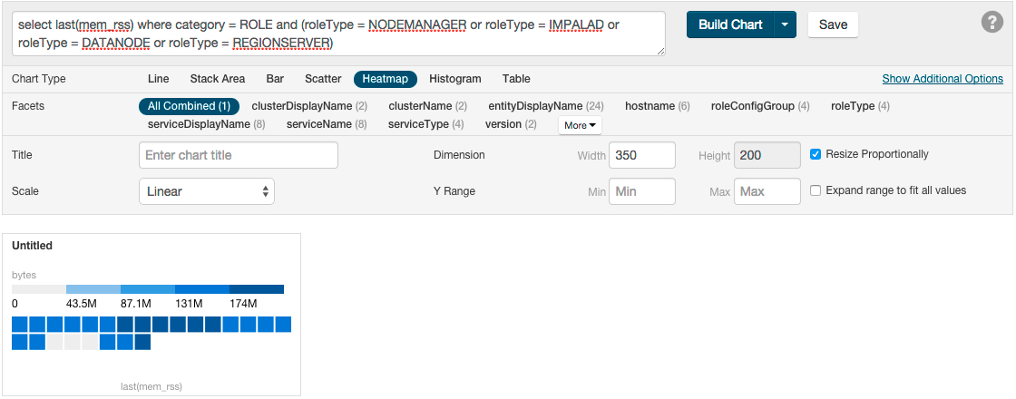
Heatmap - Displays a metric
thermometer and grid of colored squares. The thermometer displays
buckets that represent a range of metric values and a color coding
for the bucket. Each square represents an entity and the color of
the square represents the value of a metric within a range. The
following heatmap shows the last value of the resident memory for
the NodeManager, ImpalaD, DataNode, and RegionServer roles.
-
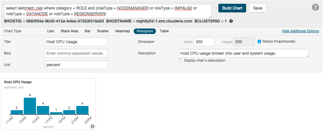
Histogram - Displays the time
series values as a set of bars where each bar represents a range
of metric values and the height of the bar represents the number
of entities whose value falls within the range. The following
histogram shows the number of roles in each range of the last
value of the resident memory.
- Table - Displays the time series values as a table with each row containing the data for a single time value.