Highlights are a practical way to bring attention to values that exceed a particular
threshold. Cloudera Data Visualization currently supports highlight marks at specific
values on the combined bar/line chart type, and enables you to customize these
highlights.
The following steps demonstrate how add highlights to an existing chart. To start, we are
using the visual World Population - Dual Bar and Line, developed on dataset
World Life Expectancy [data source
samples.world_life_expectancy]. For more information, see Combined
bar/line visuals.
Open the visual World Population - Dual Bar and Line in Edit
mode.
Clone the visual.
Click the Pencil icon next to the title of the visualization to
edit it, and enter the new name.
Optional: Click the Pencil icon below the title of the visualization to
add a brief description of the visual.
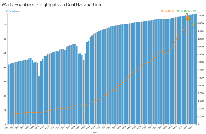
Change the title to World Population - Highlights on Dual Bar and
Line.
At the top left corner of the Visual Designer, click
Save.
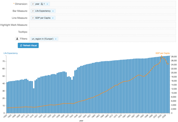
Add the un_region field to the Filters shelf, and select
Europe from the list of possible values.
This graph has more variation than the unified World data.
Click Refresh Visual.
You can see the pronounced peak in the GDP per Capita line,
centered around the year 2005.
Based on the graph, highlight the values where GDP per Capita
is over $25,000.
Place the field gdp_per_capita on the shelf Highlight Mark
Measure.
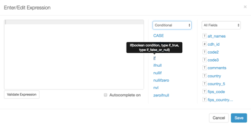
On the same shelf, click the Down arrow icon on the
gdp_per_capita field, and choose Enter/Edit
Expression.
In the Enter/Edit Expression window modal, delete the text in
the default expression, change the function groupings to
Conditional, and select the if
statement.
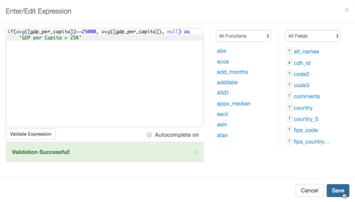
Complete the expression template.
It should look similar to the following expression:
Optionally, you can alias the highlight; see the bold font in the changed
expression.
if(avg([gdp_per_capita])>=25000, avg([gdp_per_capita]), null)
            as 'GDP per Capita > 25K'
Click Save.
Save the visual, and then click View to change to
View mode.
Optional: The default highlight mark is a circle. To convert it to another type, use the visual
Settings interface as described in Change highlight type. You can also
change the relative size of the mark as described in Change highlight type.