Labelled bars
In Cloudera Data Visualization, you can use the Labels shelf to display the measurement value. This way you can improve the comparison of relative measures on Bar visuals.
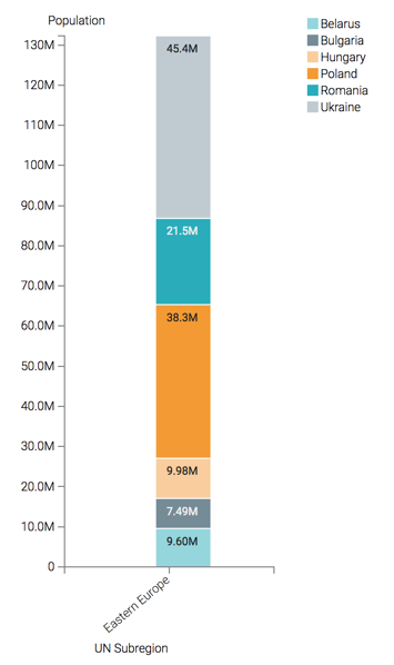
This example uses the visual previously created in Stacked bars. Clone it and make the changes to the duplicate visual.
To add labels to bar charts, follow these steps.
- Optional:
Increase the width of the bars as described in Bar size range.
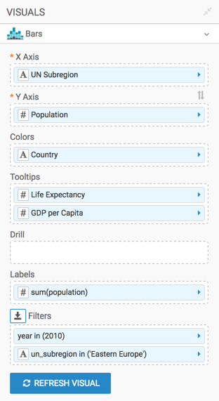
Your shelf setup should look something like the following:
-
Click REFRESH VISUAL.
The visual changed. You can see the relative size of total populations for the UN Subregion on one bar, and read off the value.