Stacked bars

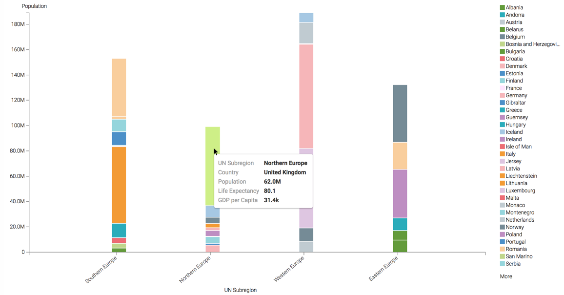
While bar charts show comparisons among categories, Cloudera Data Visualization stacked bar charts show the bars divided into sub-parts. This demonstrates the cumulative effect of the component parts of a particular category.

This example uses the visual previously created in Bars. Clone it and make the changes to the duplicate visual.

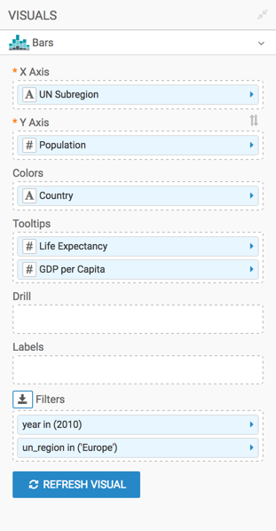
To develop a stacked bar representation of European population divided by its subregions, follow these steps.

  1. Remove Life Expectancy from the Y Axis shelf and un_region from the Colors shelf.
  2. From Dimensions in the DATA menu, drag un_subregion to the X Axis shelf.
  3. Under Measures, select population and drop it to the Y Axis shelf.
  4. Pull Country from the X Axis shelf to the Colors shelf.
  5. On the Filters shelf, set year to 2010 and un_region to Europe.
  6. Optional: Add all fields of interest to the Tooltips shelf.
    For example, add life_expectancy and gdp_per_capita.
  7. Optional: Adjust Display Format for the values on the main shelves of the visual and in the Tooltip shelf.
    For example, set the gdp_per_capita to Currency, with $ symbol.
  8. Alias the fields on the shelves as UN Subregion, Population, GDP per Capita, and so on:
    1. Click the field on the shelf of the visual to open the FIELD PROPERTIES menu.
    2. Open the Alias menu and enter the alias name of column in the textbox as it should appear in the visual.
    3. Click the x icon at the top of the FIELD PROPERTIES menu to close it.

      The shelf now shows the column with its alias name.

  9. Click REFRESH VISUAL.

    The visual has changed. You can see the relative size of total populations for the subregions, and the component countries for all subregions.

  10. Optional: If you hover the mouse over the graph, you can see the tooltip text for each country.
  11. Rename the visual.
  12. At the top left corner of the Dashboard Designer, click SAVE.