Choropleth US county map

In CDP Data Visualization Map visuals, you can plot measurements as areas over US County regions.

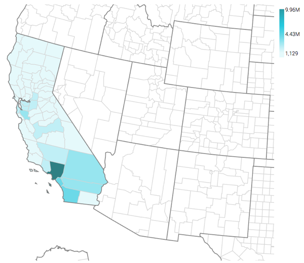
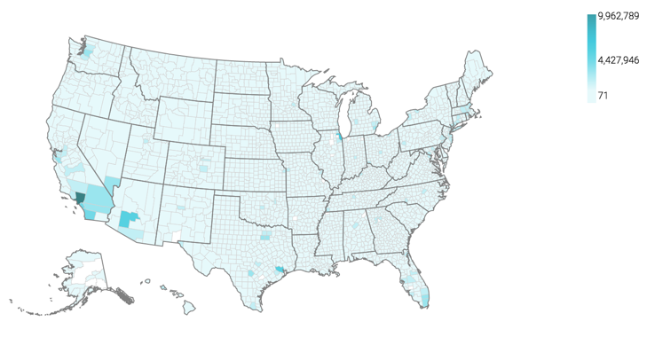
A county map of the United States shows a comparison of measurement values across US States. The following steps extend the work completed in State map, choropleth, and demonstrate how to create a map visual on the dataset US County Populations [data source samples.us_counties]. It produces colored regions for the measurements that correspond to the county field.

  1. Clone the US State Population - Choropleth Map visual that you developed in State map, choropleth.
  2. Under Dimensions, select ctyname and add it to the Geo shelf.
  3. Click the field to open the FIELD PROPERTIES menu, expand the Change Type option, and select the Geo Type County.
  4. Alias the field ctyname as County.
    For instructions, see Alias.
  5. Click REFRESH VISUAL.
    The map visual appears.
  6. If not already selected, select the Enable pan and Zoom and Zoom to active area options, as described in Customizing zoom.
  7. Optional: Under Dimensions, select stname and add it to the Filters shelf. When the Filter for stname window modal appears, select California in the Values tab, and click APPLY.
  8. Click REFRESH VISUAL.
    The map automatically zooms in to show detail of California.
  9. Click the pencil/edit icon next to the title of the visualization to enter a name for the visual.

    In this example, the title is changed to 'US County Population - Choropleth Map'. You can also add a brief description of the visual as a subtitle below the title of the visualization.

  10. At the top left corner of the Dashboard Designer, click SAVE.