Latitude and longitude map with bubbles
Cloudera Data Visualization Map visuals support measurement plots over a geographic map, based on latitude and longitude. Bubble maps display up to two measurements simultaneously: as the color of the bubble, and as the relative size of the bubble.
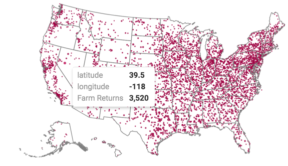
A geographic coordinate map of the United States, based on degrees of
latitude and longitude, shows a comparison of
measurement values across US States. The following steps extend the work completed in
US zipcode map with bubbles, and demonstrate how to create a map visual on
the Income Tax Returns dataset. It produces maps with bubble marks that correspond to
the relative size of the measurement at each latitude and
longitude pair.
Before starting this exercise, supplement the Income Tax Returns dataset by adding
data from zipcode-lat-long.csv into your database, and making a simple
joins between zip_tax_returns_2016.zipcode and
zipcode_lat_long.zipcode. For instructions, see Data model:
joins.
-
Click REFRESH VISUAL.
The map visual appears. You can move the visual (pan), zoom in and out, and see the details in the Tooltips text.