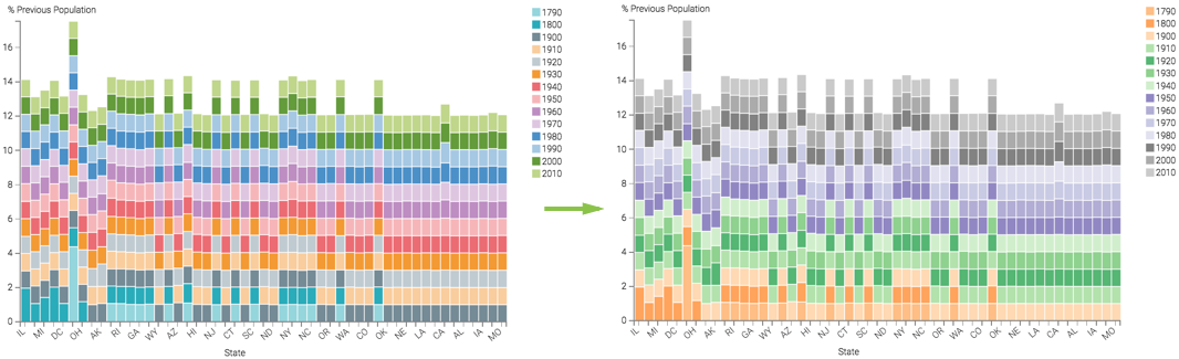
Changing visual color palette
Click on a different color palette in the Colors catalog to
choose a different color palette for your visualization.
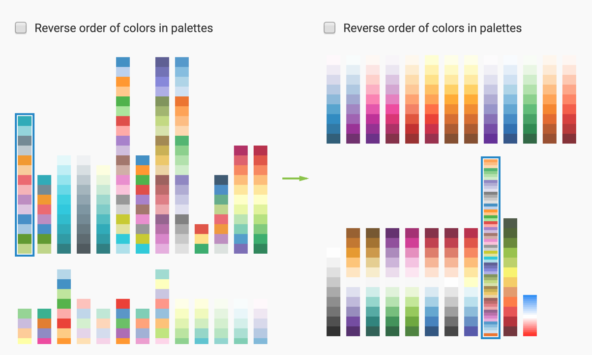
The colors in the visual change. The legend is a good indicator of this.
For gauge visuals, this change affects the representation of qualitative ranges.

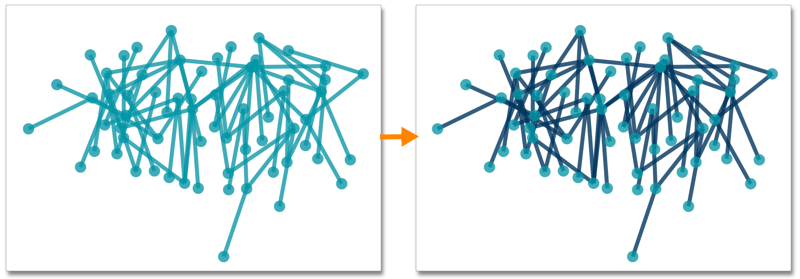
In network visuals, you can specify two separate palettes: one for the nodes, and one for the links: