Visualizing Experiment Results
After you create multiple runs, you can compare your results.
- Go to Experiments and click on your experiment name. Cloudera AI displays the
Runs table populated by all of the runs for the experiment.
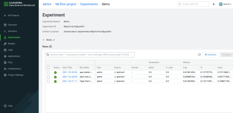
- You can search your run information by using the search field at the top of the Run table.
- You can customize the Run table by clicking Columns, and selecting the columns you want to display.
- You can display details for a specific run by clicking the start time for the run in the Run table. You can add notes for the run by clicking the Notes icon. You can display the run metrics in a chart format by clicking the specific metric under Metrics.
- To compare the data from multiple runs, use the checkbox in the Run table to select the runs you want to compare. You can use the top checkbox to select all runs in the table. Alternatively, you can select runs using the spacebar and arrow keys.
- Click Compare. Alternatively, you can press
Cmd/Ctrl + Enter. Cloudera AI displays a separate
window containing a table titled Run Comparison and options for
comparing your parameters and metrics.
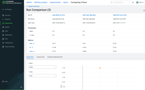
This Run Comparison table lists all of the parameters and the most recent metric information from the runs you selected. Parameters that have changed are highlighted
- You can graphically display the Run metric data by clicking the metric names in the
Metrics section. If you have a single value for your metrics, it will
display as a bar chart. If your run has multiple values, the metrics comparison page displays
the information with multiple steps, for example, over time. You can choose how the data is
displayed:
- Time (Relative): graphs the time relative to the first metric logged, for each run.
- Time (Wall): graphs the absolute time each metric was logged.
- Step: graphs the values based on the cardinal order.
- Below the Run Comparison table, you can choose how the Run information
is displayed:
- Scatter Plot: Use the scatter plot to see patterns, outliers, and anomalies.
- Contour Plot: Contour plots can only be rendered when comparing a group of runs with three or more unique metrics or parameters. Log more metrics or parameters to your runs to visualize them using the contour plot.
- Parallel Coordinates Plot: Choose the parameters and metrics you want displayed in the plot.