Creating a dashboard with date filters

In Cloudera Data Visualization, the quick date filter enables you to provide a quick selection of date ranges for visualizing your data.

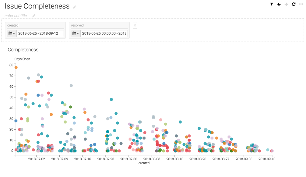
This example shows a dashboard with a Scatter visual that plots created and resolved issues.

  1. Create a new dashboard and name it 'Issue Completeness'.
  2. In the Dashboard Designer, create a Scatter visual based on the Issue Tracker dataset.
  3. Populate the shelves from the available Dimensions and Measures fields in the DATA menu.
    1. Under the X shelf, add created from Measures.
    2. Under the Y shelf, add resolved from Measures.
    3. Click the field to open the Field Properties menu and make the following changes:
      • Select Enter/Edit Expression, enter the following expression, and click SAVE:
        if([resolved] IS NOT NULL,datediff([resolved],[created]),datediff(now(),[created]))
      • Select Alias and name the field 'Days Open'.
    4. Under Colors, add assignee from Dimensions.
    5. Under Tooltips, add the following fields:
      • Description
      • Issue Key
      • Assignee
      • Date Open
      • Date Closed
    6. Under Filters, add created and resolved from Dimensions.
  4. Click REFRESH VISUAL.
  5. Click SAVE.
    The visual appears in the main area of the dashboard interface.
  6. Add two date filters, created and resolved in the dashboard, with a date range from 2018-06-25 to 2018-09-12.
    For information on how to create date filters in a dashboard, see Using fixed dates (date range picker) mode.
  7. Click SAVE.
The following image shows the new dashboard you have created. This visual does not include the null values in the dataset.
Proceed to the next section to learn how to include null values in a visual.