Using the trellis option with areas
In Areas visuals, Cloudera Data Visualization enables you to create Trellis charts that show different partitions (segments) of the dataset alongside one other.
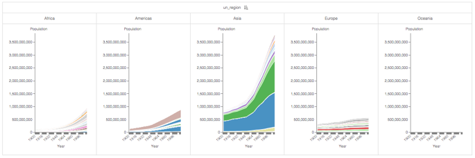
This example uses the visual World Population - Area from Areas to create trellis charts.
The following steps demonstrate how to create a new trellised Area visual on the World Life Expectancy dataset.
-
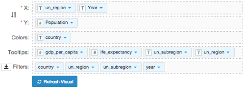
Under Dimensions, select
un_regionand drag it to the X shelf. If it is not the first (left-most) field on the shelf, drag it to the left of the fieldYear.The first element on the shelf controls the category of the trellis.
-
Click REFRESH VISUAL.
The new trellised area chart appears.