Areas
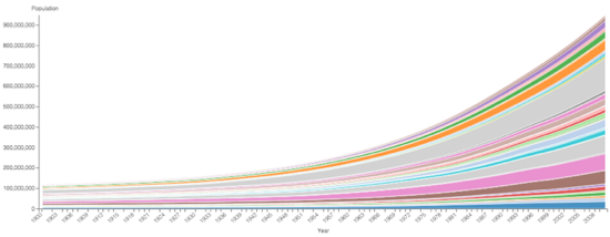
In Cloudera Data Visualization, Areas visuals are a good choice for representing related values over time because they emphasize the relative proportions of totals or percentage relationships. With volume stacked beneath the line, the chart clearly demonstrates both the total of the fields and their relative size.
The following steps demonstrate how to create a new Areas visual on the World Life Expectancy dataset. For an overview of shelves that specify this visual, see Shelves for areas.
-
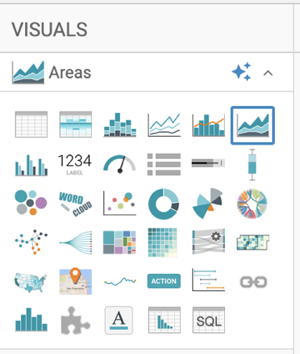
In the VISUALS menu, find and click
Areas.
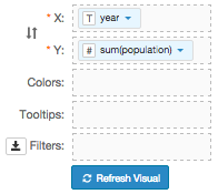
The shelves of the visual changed. The mandatory shelves are X Axis and Y Axis. The fields placed on these two shelves may be easily swapped by switching X and Y.
-
Populate the shelves from the available fields (Dimensions,
Measures) in the DATA menu.
-
Under Dimensions, select
yearand drag it to the X shelf. -
Under Measures, select
populationand drag it to the Y shelf.
-
Under Dimensions, select
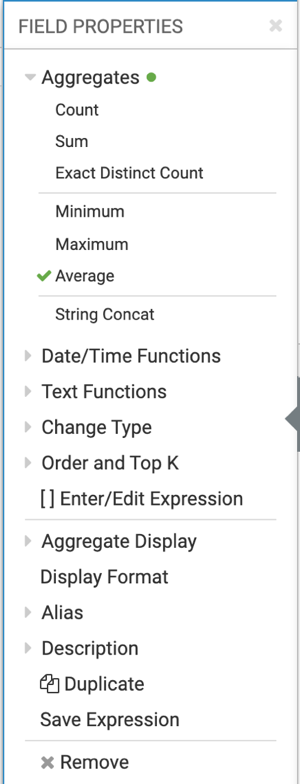
- Change the aggregate of the
populationfield fromsum(population)toavg(population):-
Select .
-
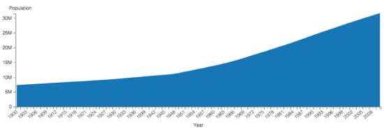
Click REFRESH VISUAL.
The Areas visual appears.
-
Select .
-
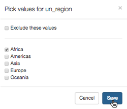
In the Pick values for un_region modal window, select
Africa and click Save.
-
Click REFRESH VISUAL.
The updated Areas visual appears.