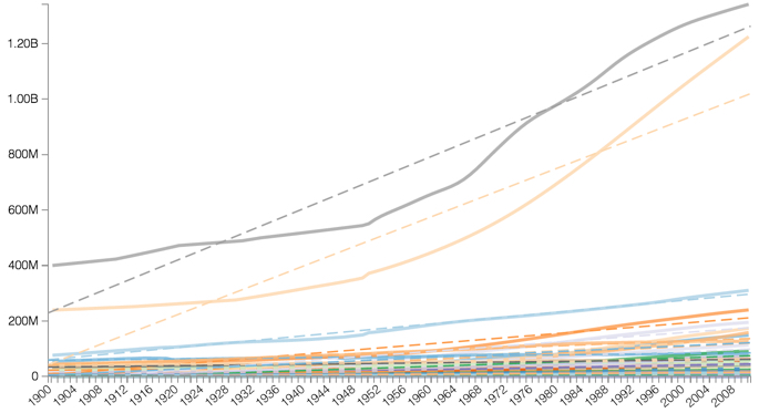
Separating trendlines by color
Cloudera Data Visualization enables you to separate all linear trendlines and plot them in the same color as main data they describe.
To separate all the linear trendlines and plot them in the same color as main data they describe, navigate to the Marks menu, and select Separate trendlines by color.

Note that the trendlines of visual match the color of the line dimension they describe.