
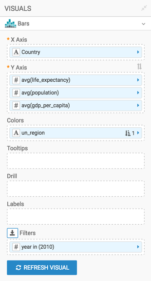
Trellis on measures
Some visual types (bars, lines, areas, and grouped bars) may be trellised on measures, simply by adding more fields to the measurement shelf.
You can change the chart developed in Bars (Country /
Life Expectancy) into a visual trellised on three measures: Life
Expectancy, Population, and GDP per Capita. You
can accomplish this by placing all three measurements on the Y Axis
shelf.
-
Click REFRESH VISUAL.
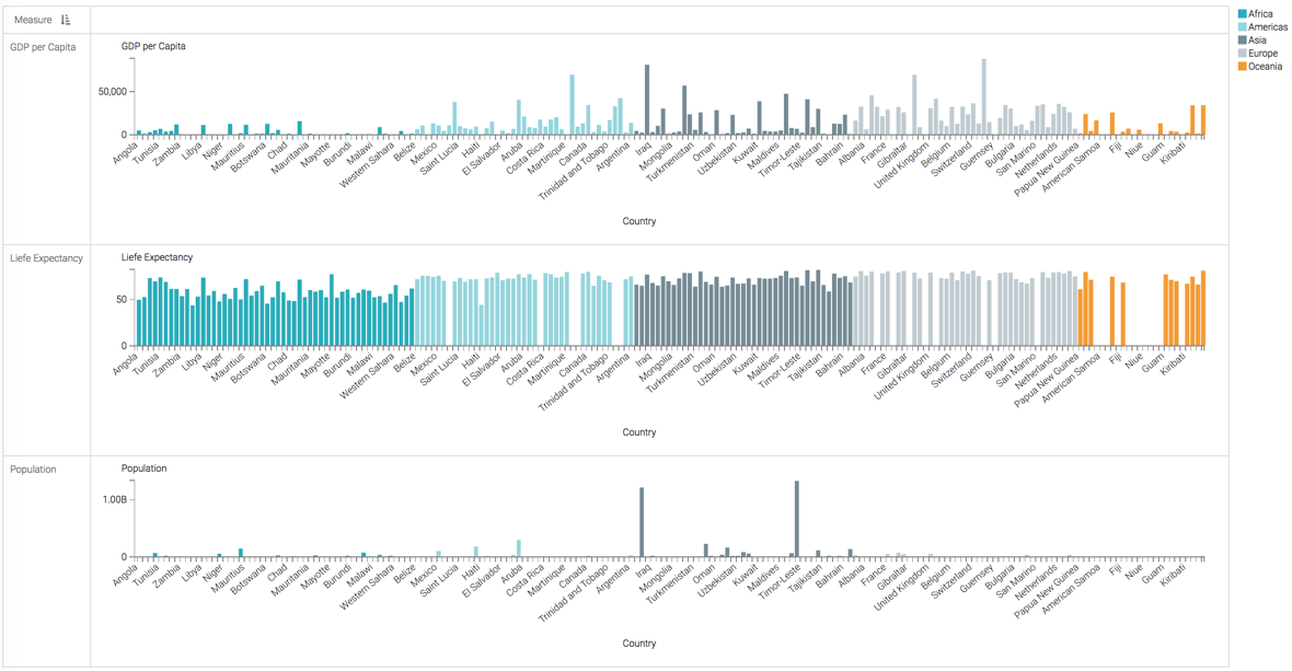
This setup produces a measurement-trellised bar chart visual.
To compare this approach with plotting two measures onto the same line chart, see Line visuals with dual axes.
