Ensuring consistent colors on dimension values
Cloudera Data Visualization enables you to make colors consistent on dimension values. In dimensions where several visuals include same dimension values, it is helpful if these values are colored identically. It also removes the need to add multiple legends on the same dashboard.
This feature applies to bar visuals, line visuals, area visuals, combined bar/line visuals, and pie visuals.
For this feature to work properly, you must ensure that the target visuals use the same color palette.

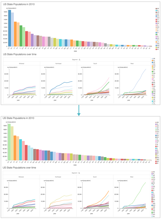
In the following example, we show how to standardize colors for a US State Population dashboard that uses a bar visual and a trellised line visual.
Compare the color values for the two visuals in the top graph. It can be easily seen that the legends for the visuals don't match. However, they are identical in the bottom dashboard, where we enabled the color consistency feature.