Filtering 1: Bar chart by year
When working with a very large set of data, it is necessary to quickly access and examine a specific subset of information. Cloudera Data Visualization gives you the ability to filter information on all fields of the dataset.
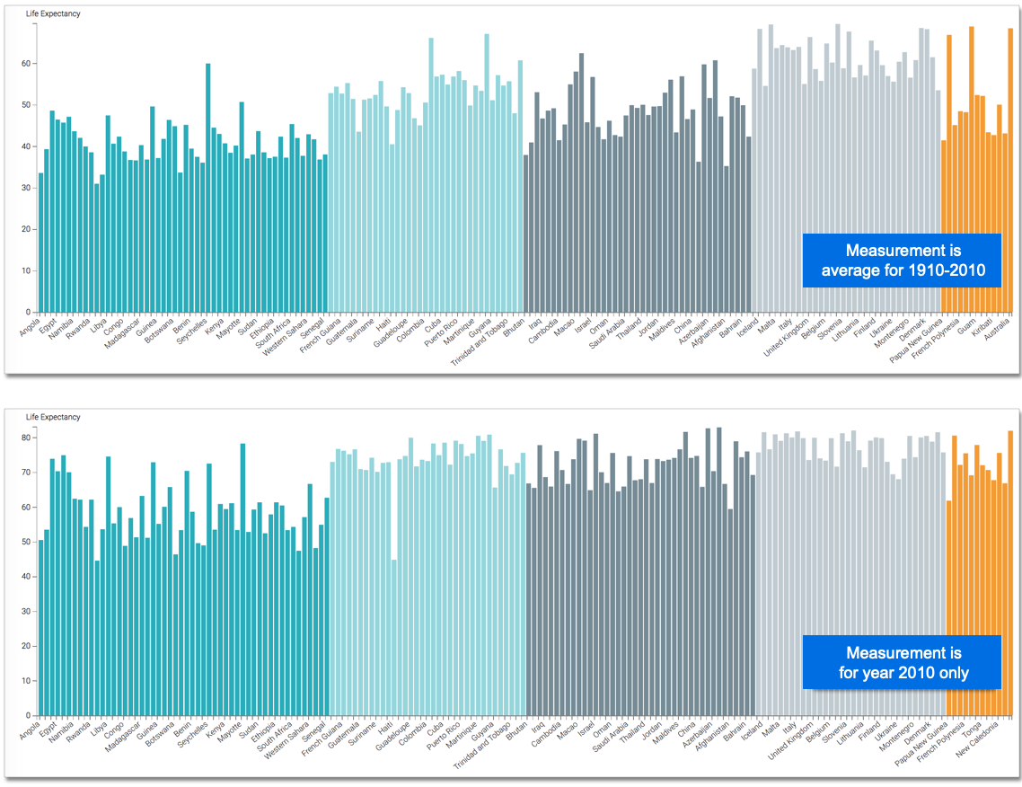
This example shows how to use such a filter to limit the result set and visualization to one year. It uses the visual previously created in Bars. Clone it and make the changes to the duplicate visual.
To use this visual to see the bar chart for a specific year such as 2010, follow these steps:
-
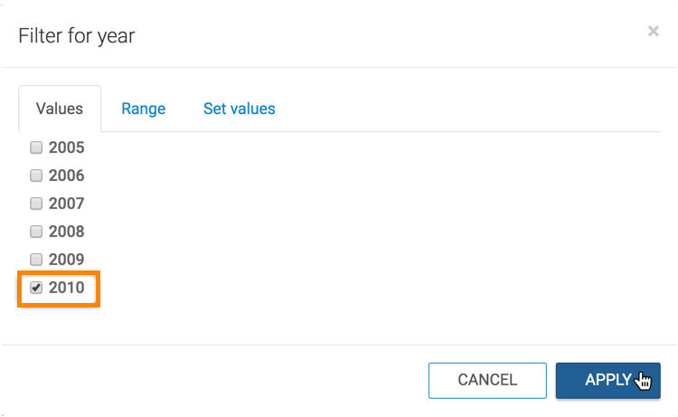
Set the filter value for
yearto 2010.-
Click the field on the shelf of the visual to open the FIELD PROPERTIES menu.
-
Click Select values.
-
In the Filter for year modal window, select 2010 and click APPLY.
-
-
Click REFRESH VISUAL.
The Bars visual for year 2010 has changed compared to the previous display, which was averaged over the 1900 - 2010 time span.