Using Analytic FunctionsPDF version

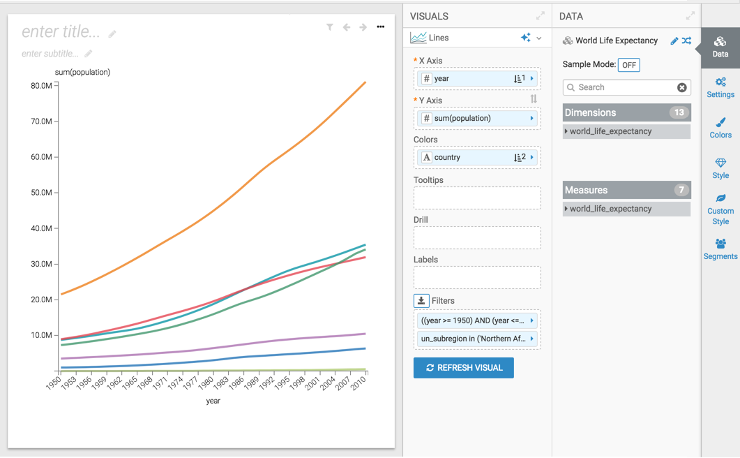
Setting up a basic visual for aggregates

In this example, a basic line visual is created on the World Life Expectancy dataset. In subsequent topics, this visual is used to demonstrate how the various analytic functions for aggregates work.
  1. Open a new visual.
  2. In the VISUALS menu, select the Lines visual type.
  3. Populate the shelves of the visual from the fields listed in the Data menu:
    • X Axis

      Add the field year. Order it in ascending order.

    • Y Axis

      Add the field population.

    • Colors

      Add the filed country. Order it in ascending order.

    • Filters

      Add the field year, and set it to the interval of 1950 through 2010.

      Add the field un_subregion, and set it to Northern Africa.

  4. Click REFRESH VISUAL to see the new line visual.
  5. Name the visual Basic Lines.
  6. Click SAVE.

We want your opinion

How can we improve this page?

What kind of feedback do you have?