
Configuring ranges on a date/time filter
In Cloudera Data Visualization, you can easily configure real-time filters that enable you to navigate across visuals built on time series. Both historical data and ongoing data feeds are supported.
-
Hover over the upper right corner of the filter and click
 to
configure the filter.
to
configure the filter.
The Settings modal window opens on the Basic tab.
-
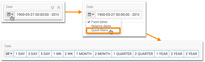
On the filter, click the Calendar icon and select the
Quick filters option from the menu.
The appearance of the filter changes to show the set of defined date ranges.
For instructions on how to use the quick filter, see Using quick filters.
