Cloudera Data Visualization enables you to create a basic Scatter
visual.
The following steps demonstrate how to create a new Scatter visual representation, showing
the trend of life-expectancy and GDP per capita for selected countries.
Start a new visual based on the World Life Expectancy dataset. The
data source for this is samples.world_life_expectancy.
For instructions, see Creating a visual.
In the visuals menu, find and click Scatter.
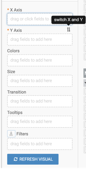
The shelves of the visual changed. They are now X Axis,
Y Axis, Colors,
Size, Transition,
Tooltips, and Filters. The mandatory
shelves for Scatter visuals are X Axis and Y
Axis. The fields placed on these two shelves may be easily swapped by
switching X Axis and Y Axis.
Populate the shelves from the available fields of Dimensions and
Measures in the DATA menu.
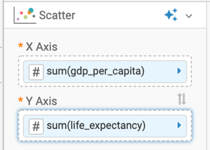
Under Measures, select gdp_per_capita and
drag it to the X shelf.
Under Measures, select life_expectancy and
drag it to the Y shelf.
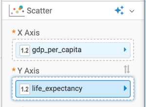
In both cases, remove the aggregate to see individual data points.
On the shelf, on the sum(gdp_per_capita) field, click the
(right arrow) icon to open the FIELD
PROPERTIES menu.
Expand Aggregates and click the check mark next to
Sum to remove the aggregate.
Repeate it for the sum(life_expectancy) field
The shelves now contain the modified fields.
Click REFRESH VISUAL.
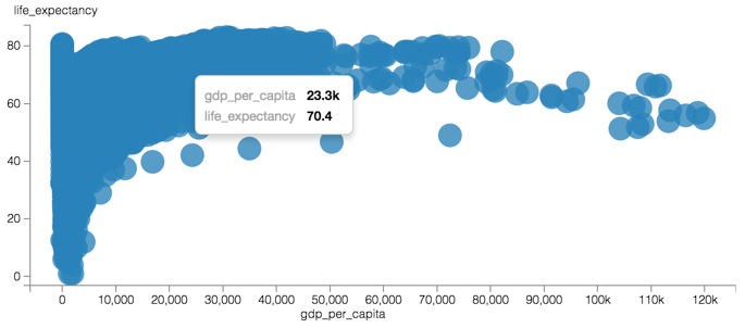
The Scatter visual appears.
While you can see the general shape of data and a few outliers, there is too little
distinguishing information to help us understand the trends.
Use the Colors shelf to see if a pattern emerges.
Under Dimensions, select country and drag it to
the Colors shelf .
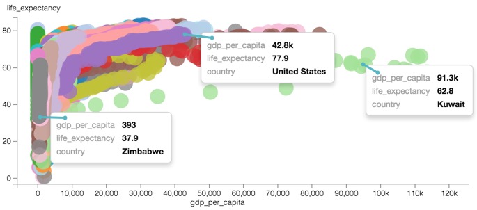
Click REFRESH VISUAL and examine the resulting graph.
You can now see the trend for some of the countries very clearly, over time. The
visualization is less than ideal, yet obvious details show:
Zimbabwe, in gray, shows an appreciable increase in life expectancy, but relative to
other countries, very little economic improvement (measured as GDP per capita).
United States, in purple, shows the expected improvement in both longevity and in
GDP.
Kuwait, in light green, is a true outlier that shows phenomenal increase in GDP per
capita, but suffers a noticeable decrease in life expectancy from about the
mid-century to present day.
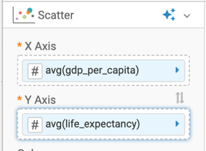
Add aggregation back to the measures on the X Axis and
Y Axis shelves. This time, you want to see the average of the
dimensions.
On the shelf, on the gdp_per_capita field, click the
(right arrow) icon to open the FIELD
PROPERTIES menu.
Expand Aggregates and select
Average.
Repeate it for the life_expectancy field
The shelves now contain the modified fields.
Optional: Turn on the Changing legend style and removing the legend feature.
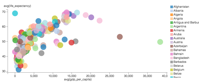
Click REFRESH VISUAL.
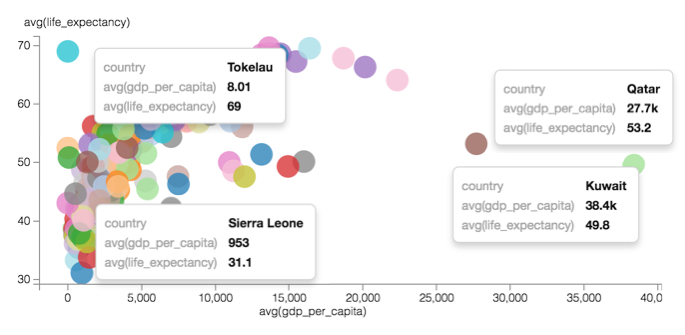
The Scatter visual appears.The distribution is an average of ALL years covered by the dataset, from 1990
through 2010. Still, some outliers are already clearly visible: Qatar and Kuwait for
exceptionally high GDP per capita, Tokelau for high life expectancy at very low GDP per
capita, and Sierra Leone, with the lowest life expectancy in the world.Figure 1. Contrasting Average Life Expectancy and GDP Per Capita, World-Wide
Click the pencil/edit icon next to the title of the
visualization to enter a name for the visual.
In this example, the title is changed to 'World Population - Scatter'. You can also add
a brief description of the visual as a subtitle below the title of the
visualization.
At the top left corner of the Dashboard Designer, click
SAVE.
It is useful to remember at this point that GDP per capita is actually influenced by the
population of the country.
As a next step, look at how you can show the population variation on this graph, by Adding
size to a scatter visual.