Field statistics
Cloudera Data Visualization enables you to create Field statistics visuals. Field statistics visuals describe the dataset in statistical terms. They work across all data connections, and on datasets that contain table joins.
-
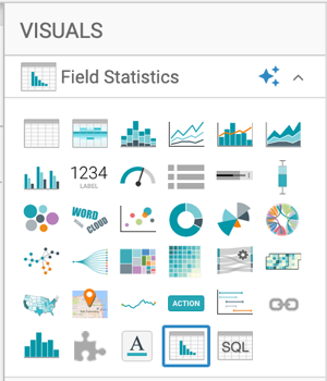
Select Field Statistics in the
VISUALS menu.
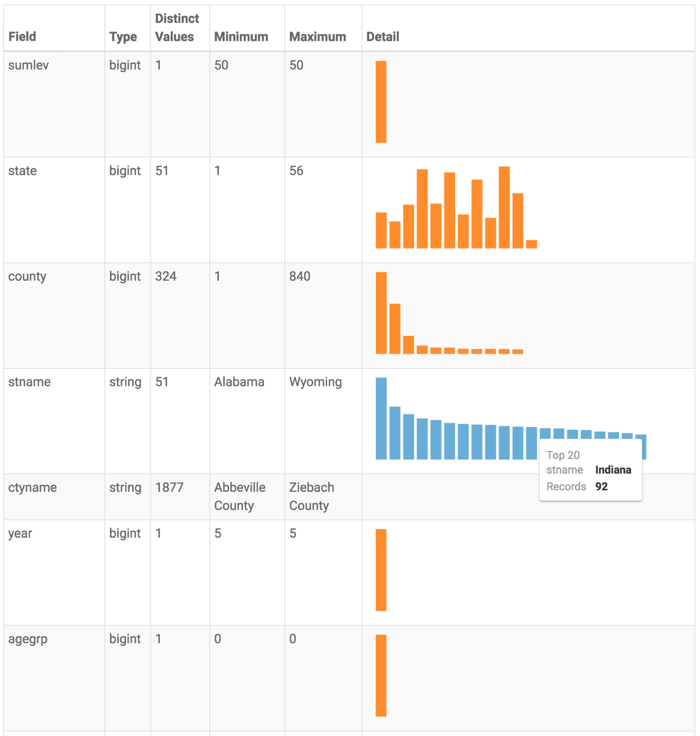
 The visual appears as a table that shows the following statistical information for each field in the dataset.
- Actions column contains some widgets for making changes to the appearance of the table.
- Field column indicates the name of the dataset field, and provides an option to include only a limited number of top values, when applicable.
- Type column indicates the data type of the dataset field.
- Distinct Values column reports the number of distinct values for this field. This is typically a good indication of the field's suitability as a dimension.
-
Minimum column reports the smallest (lowest) value in the dataset field. For strings, this would be the 'least' in alphabetical sort.
In this example, for field
stname(state name), this would be Alabama, and for fieldctyname(county name), this would be Abbeville County. -
Maximum column reports the largest (highest) value in the dataset field. For strings, this would be the 'greatest' in alphabetical sort.
In this example, for field
stname(state name), this would be Wyoming, and for fieldctyname(county name), this would be Zieback County. - Detail column holds a graphic that is either a bar chart of top K values, or a distribution histogram of these values, for each column.
-
You can make changes to the visual through the following actions:
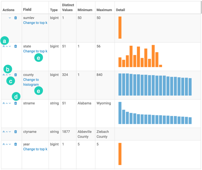
In View mode, the Field statistics visual does not have actions, or it does not contain the Actions column.