US state map with bubbles
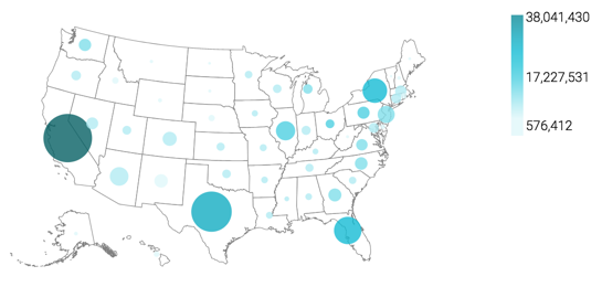
CDP Data Visualization Map visuals let you plot measurements, as bubbles, over US State regions. Bubble maps display up to two measurements simultaneously: as the color of the bubble, and as the relative size of the bubble.

A map of the United States shows a comparison of measurement values among US States. The following steps demonstrate how to create a new map visual on the dataset US County Population [data source samples.us_counties]. This produces a map with bubble marks that correspond to the total population of each state.

  1. Clone the visual that you developed in State map, choropleth.
    For instructions, see Cloning a visual.
  2. Optional: Add a measure to the Size shelf.

    For example, to show the relative size of the Hispanic population across the country, use the following expression in the Enter/Edit Expression editor:

    sum([h_female]+[h_male])

    For more information, see Enter or edit expressions.

  3. Change the map from choropleth to bubble marks, as described in Displaying bubbles on maps.
  4. Adjust the size range of the marks to 1-10, as described in Changing the mark size range.
  5. Optional: Alias all the fields.
    For instructions, see Alias.
  6. Optional: Change the color palette or simply reverse it, as described in Change color palette of visuals and Reverse color palette of visuals.
  7. Optional: Enable panning and zooming option, as described in Customizing zoom.
  8. Click REFRESH VISUAL.
    The map visual appears.
  9. Click the pencil/edit icon next to the title of the visualization to enter a name for the visual.

    In this example, the title is changed to 'US State Population - Bubbles'. You can also add a brief description of the visual as a subtitle below the title of the visualization.

  10. At the top left corner of the Dashboard Designer, click SAVE.

You can move the visual (pan), zoom in and out, and see the details in the Tooltips text.