Cloudera Data Visualization enables you to create Sparklines visuals. A
Sparklines chart shows the general shape of the variation in measurement (usually over time) in
a simple, condensed, and memorable manner. Sparklines are small and succinct, and can be easily
located with the text where they are discussed. You can contrast Sparklines with typical X/Y
charts that are designed to show as much data as possible.
Start a new visual based on the World Life Expectancy dataset.
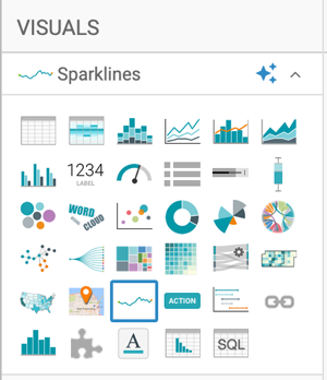
Select Sparklines in the VISUALS
menu.
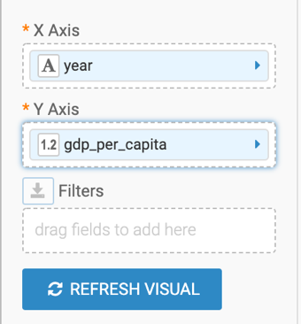
The shelves of the visual changed. They are now X Axis
(mandatory), Y Axis (mandatory), and
Filters.
Populate the shelves from the available fields (Dimensions,
Measures) in the DATA menu.
Under Dimensions, select year and drag it
to the X Axis.
Under Measures, select gdp_per_capita and
drag it to the Y Axis.
On the gdp_per_capita field of the Y Axis
shelf, click the (arrow) icon and select Aggregates > Sum.
This is necessary because the Sparklines visual type uses aggregated measurements.The Y Axis shelf now contains the modified field
sum(gdp_per_capita).
Click REFRESH VISUAL.
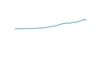
The Sparklines visual graph appears.
On the Filters shelf, add several
Dimensions and Measures from the
DATA menu.
This enables you to dynamically control the data input and to discover the data at a
more granular level.
For example, from Dimensions, drag
country, un_subregion, and
un_region to the Filters shelf.
Click the (pencil) icon next to the title of the visualization
to edit it, and enter World Population - Sparklines as the new name.
Click SAVE at the top left corner of the Dashboard
Designer.
We want your opinion
How can we improve this page?
What kind of feedback do you have?
This site uses cookies and related technologies, as described in our privacy policy, for purposes that may include site operation, analytics, enhanced user experience, or advertising. You may choose to consent to our use of these technologies, or