Bullet

CDP Data Visualization enables you to create Bullet visuals.

Bullet visuals are a variation of bar charts, customized for showing progress towards a predefined goal. They are developed specifically for financial data, but may be used in many other situations. They are an alternative to gauges.

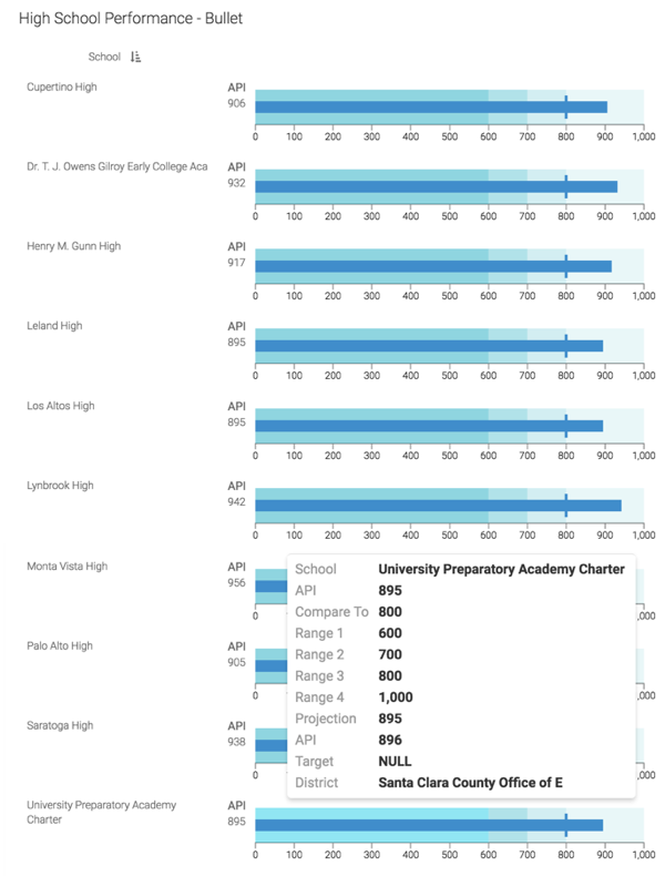
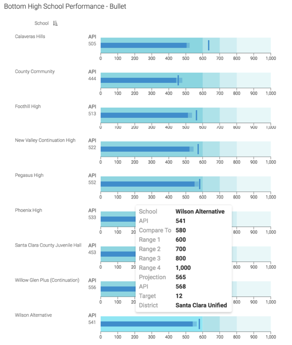
This is an example of a Bullet visual for a high schools. It illustrates the various elements of the bullet chart.

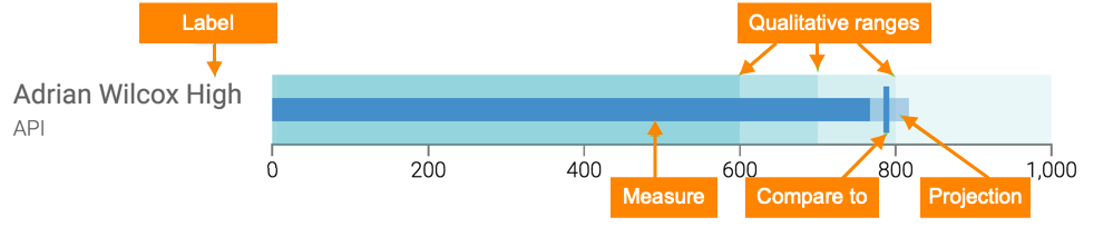
  • The dark bar in the middle of the visual represents the value on the Measure shelf. It is the feature measurement of the visual.
  • The lighter-shaded extension of the same bar is the expected value of the measure at a future date. This value is on the Projection shelf of the visual.
  • The vertical bar is the target value of the measurement. Place this calculation on the Compare To shelf.
  • Calculations on the Qualitative Ranges shelf determine the upper limits of the 'goodness' for the current measurement. From the origin to the upper value, they specify poor, better, good, and excellent performance. You may define anywhere from 0 to 4 qualitative ranges.
  • The Label shelf overrides default labeling taken from the Measure shelf. This is an opportunity to clarify what is being measured, as well as the units of measurement. This shelf accepts a maximum of two values.

Just as other CDP Data Visualization visuals, the Bullet visual may be trellised using X and Y shelves, have additional fields on the Tooltips shelf, and you can use Filters with it. It also includes additional setting adjustments. For more information, see Shelves for bullet visuals.

The following example uses the 2012 and 2013 API Scores for California Schools. The School Performance dataset is used, which was built on a datafile that contains the California School APIs from 2012 and 2013. The range of possible scores varies from a low of 200 to a high of 1000. The statewide API performance target for all schools is 800. However, each school that has not achieved that target may have a more realistic score set for it by the Department of Eduction, based on a number of factors we will not discuss here.

  1. Start a new visual based on the School Performance dataset.

    For instructions, see Adding data, Creating datasets, and Creating a visual.

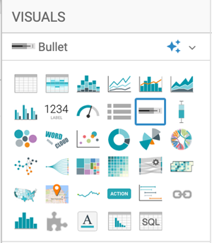
  2. In the VISUALS menu, find and click Bullet.

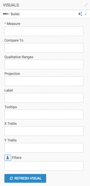
    The shelves of the visual changed. They are now Measure (mandatory), Compare To, Qualitative Ranges, Projection, Label, Tooltips, X Trellis, Y Trellis, and Filters.

  3. Populate the shelves from the available fields ( in Dimensions and Measures) in the DATA menu.
    1. Measure - Add the field Api13, and change the aggregation, so that the shelf contains max([Api13]).

      [Optional] Limit the output to the top 10 performers:

      1. Click the (right-arrow) icon to the left of the field, and select the Order and Top K option.
      2. After the menu expands, enter 10 in the Top K option.

      [Optional] Alias the field as the name of the measurement. In this case, use API.

    2. Compare To - Add the field Api12. Then customize the expression to reflect whether the school reached the state-wide target of API=800.
      1. Click the (right-arrow) icon to the left of the field, and select the [ ] Enter/Edit Expression option.
      2. In the Enter/Edit Expression modal window, change the expression to the following formula:
        Max(if([Api12] < 800, [Api12] + [Target], 800))
      3. Click VALIDATE EXPRESSION to ensure that everything works.
      4. Click SAVE.

      [Optional] Alias the field as Compare To.

    3. Qualitative Ranges - Add the field Api12. Then, specify the equation that returns the upper limit of the first qualitative range. For this visual, simple scalar values are used.
      1. Click the (right-arrow) icon to the left of the field, and select the [ ] Enter/Edit Expression option.
      2. In the Enter/Edit Expression modal window, change the expression to the scalar value 600, and click SAVE.
      3. To create other ranges, simply click the (right-arrow) icon to the left of this field, and select the Duplicate option. Then open the Enter/Edit Expression modal window for the duplicate, change the value, and click SAVE.

        In this example, four ranges are defined: at 600, 700. 800, and 1000.

      4. [Optional] Alias the ranges as Range 1, Range 2, Range 3, and Range 4.

    4. Projection - Add the field Api13. Then, specify the equation that projects the current measurement to some future date.
      1. Click the (right-arrow) icon to the left of the field, and select the [ ] Enter/Edit Expression option in the FIELD PROPERTIES menu.
      2. In the Enter/Edit Expression modal window, change the expression to the following formula and click SAVE:
        if(max([Api13]) > 800, max([Api13]), max([Api13]) + 2 * max([Target]))
      3. [Optional] Alias the field as Projection.

    5. Label - Add the field Api13, and convert the aggregation to maximum, for max([Api13]).

      [Optional] Duplicate the field, and change its definition to max('API'), using the Enter/Edit Expression option in the FIELD PROPERTIES menu.. Move this field over the other field.

    6. Tooltips - Add more fields here, such as Api12, Target, Dname, Sname, and so on. You can apply an Alias to these fields.
    7. Y Trellis - Add the field Sname, and Alias it as School.
    8. Filters - Add the filters here. Cname is used in this example for name of the County (selecting Santa Clara), and Stype for school type (choosing H for high school).
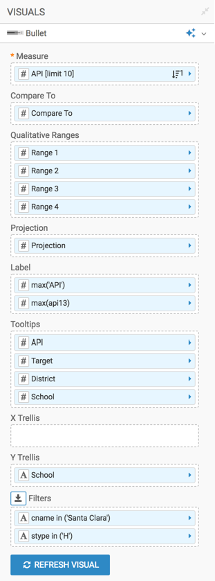
    9. Y shelf - Ad the field Sname (school name) to trellis the visual.
  4. [Optional] Click the Settings menu, select Trellis, and de-select the Show trellis borders option.
  5. [Optional] Click the Colors menu, and select different options for Background Color and Foreground Color from the color palette menu. You may change the Projection Opacity too.
  6. Click REFRESH VISUAL.
    The new Bullet visual appears. Note that it is trellised, which is why it is sorted on the Sname field (school name), not on the measure Api13.

    Additionally, the Projection value is not visible; this is because it is relatively low for high-performing schools.

  7. Change the order property of the Measure shelf by selecting the Bottom K option with a value of 10, and click REFRESH VISUAL.

    Note that in all cases here, the projection value is visible because it is relatively large compared to the projected improvement for schools that already reached the 800 API threshold.

  8. Click the pencil/edit icon next to the title of the visualization to enter a name for the visual.

    In this example, the title is changed to 'High School Performance - Bullet. You can also add a brief description of the visual as a subtitle below the title of the visualization.

  9. At the top left corner of the Dashboard Designer, click SAVE.
  10. At the top left corner of the Dashboard Designer, click CLOSE.

To adjust the Bullet visual, check all the available settings for this visual.