In Cloudera Data Visualization, Network visuals can be used to represent many
systems and structures. The implementation is dynamic, with ongoing optimization adjustments
that implement a force layout based on the Barnes–Hut approximation. It also includes many
manual setting adjustments.
In the following example, the NCAA Basketball dataset is used for years 1985 through
2018.
For an overview of shelves that specify this visual, see Shelves for
networks.
Start a new visual based on the NCAA Basketball dataset.
For instructions, see Creating a visual.
In the VISUALS menu, find and click
Network.
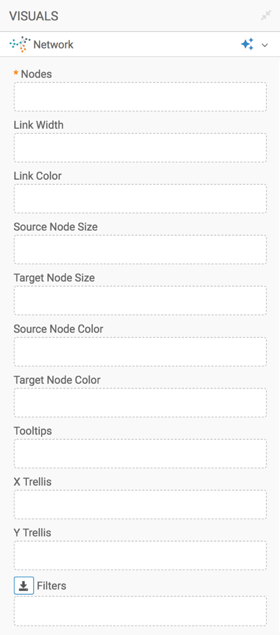
The shelves of the visual changed. They are now Nodes,
Link Width, Link Color, Source
Node Size, Target Node Size, Source Node
Color, Target Node Color,Tooltips, X Trellis, Y
Trellis, and Filters. There is only one mandatory
shelf: Nodes, which adds two dimensions from the data menu to
specify the start and end of each network connection in the plot.To learn more about the shelves of this visual, see Shelves for
networks.
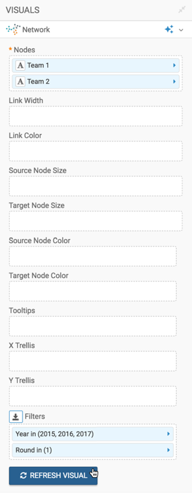
Populate the shelves from the fields available in the DATA
menu:
Under Dimensions, select Team 1 and
Team 2, and add them to the Nodes
shelf.
Under Measures, select Year and add it to
the Filters shelf. Select the years 2015,
2016, and 2017.
Add Round to the Filters shelf, and select
1.
Click REFRESH VISUAL.
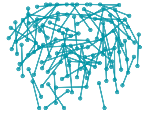
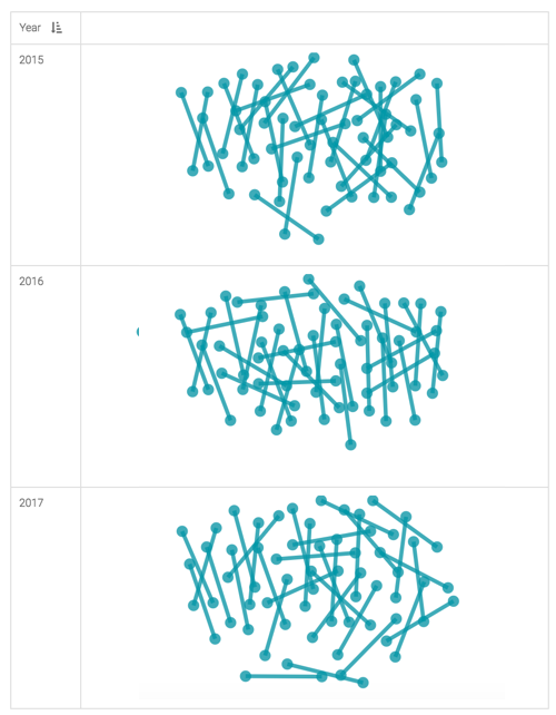
The new network visual appears. You can see that this visual shows 1:1 pairing,
because round 1 of play represents 1:1 elimination.
To show the years separately, place the Year field on the
Y Trellis shelf and click REFRESH
VISUAL.
The trellised version of the network visual appears.
Change the title to Round 1, 2015-2017.
Click (pencil icon) next to the title of the visualization
to edit it, and enter the new name.
[Optional] Click (pencil icon) below the title of the
visualization to add a brief description of the visual.
Click the pencil/edit icon next to the title of the
visualization to enter a name for the visual.
In this example, the title is changed to 'Round 1, 2015-2017'. You can also add a brief
description of the visual as a subtitle below the title of the visualization.
At the top left corner of the Dashboard Designer, click
SAVE.
To adjust the network display, check all the available settings for this visual.
For more information, see Network visuals: same source and target data values and
Advanced options for network visuals. These topics demonstrate some of the
many customizations that make the network visual an extremely versatile analysis tool.