Filtering 2: bar chart by region
When working with a very large set of data, it is necessary to quickly access and examine a specific subset of information. Cloudera Data Visualization gives you the ability to filter information on all fields of the dataset.
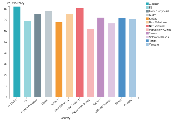
This example shows how to use such a filter to limit the result set and visualization to a particular geographic region. It uses the visual previously created in Bars. Clone it and make the changes to the duplicate visual.
To use this visual to see a bar chart for a region, such as Oceania, follow these steps:
-
Add the field
un-regionto the Filters shelf, and set its value to Oceania.-
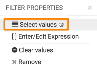
Click Select values.
-
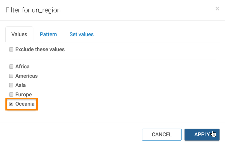
In the Filter for un_region modal window, select
Oceania and click APPLY.
-
Click Select values.
-
Click REFRESH VISUAL.
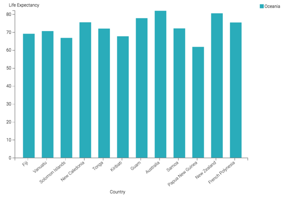
The Bars visual changed to show only the countries in the Oceania UN Region.
-
Click REFRESH VISUAL.