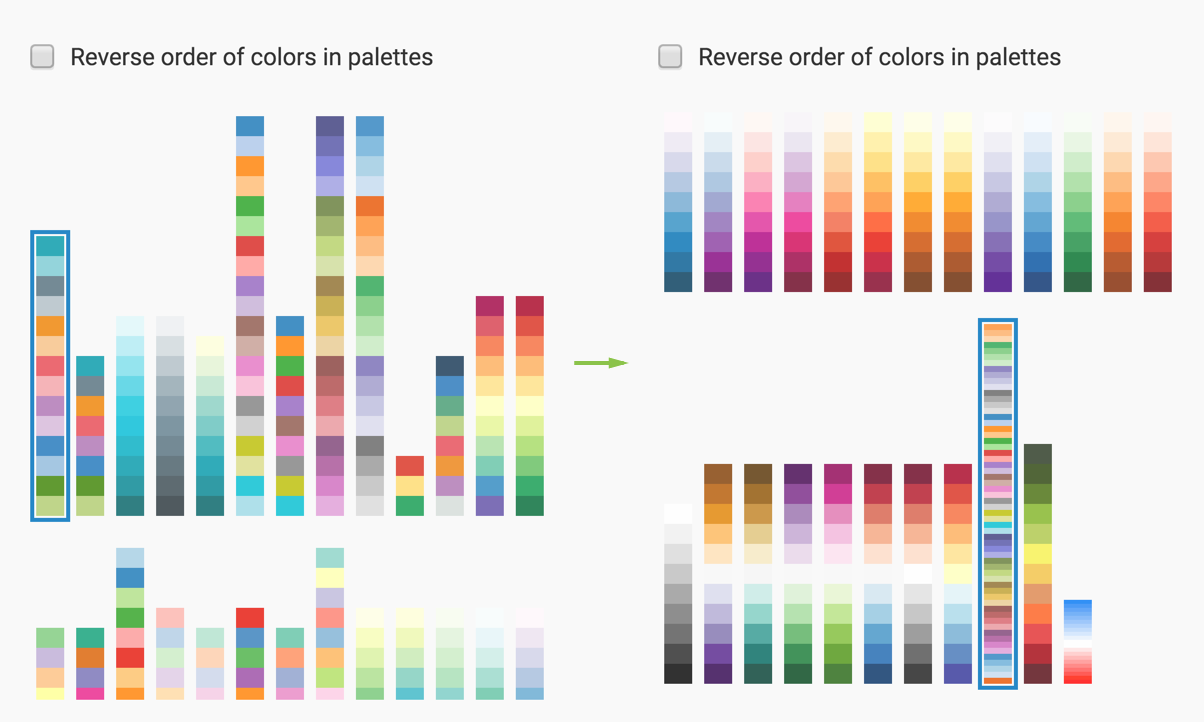
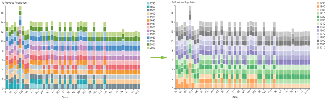
Click on a different color palette in the Colors catalog to
choose a different color palette for your visualization.
The colors in the visual change. The legend is a good indicator of this.
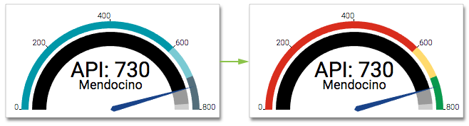
For gauge visuals, this change affects the representation of qualitative ranges.
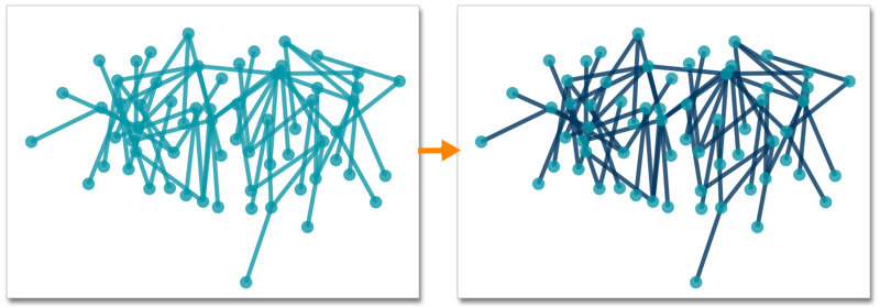
In network visuals, you can specify two separate palettes: one for the nodes, and one for
the links:
This site uses cookies and related technologies, as described in our privacy policy, for purposes that may include site operation, analytics, enhanced user experience, or advertising. You may choose to consent to our use of these technologies, or