Cloudera Data Visualization enables you to create a basic Interactive Map
visual.
The following steps demonstrate how to create an interactive map visual on the National
Geographic Features dataset. The data for this dataset comes from the United States
Board on Geographic Names based on the AllStates zip file.
Additionally, you can use Feature Class Definitions and State Abbreviations to
supplement the dataset.
For an overview of shelves that specify this visual, see Shelves for interactive
visuals.
Start a new visual based on the National Geographic Features dataset.
For instructions, see Creating a visual.
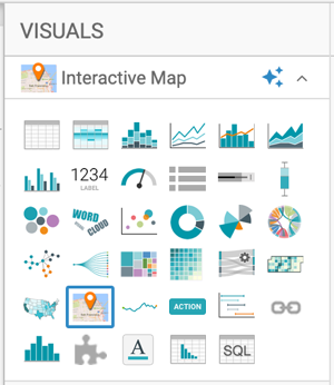
In the VISUALS menu, find and click Interactive
Map.
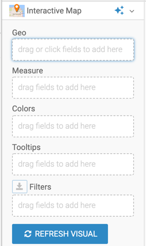
The shelves of the visual changed. They are now Geo,
Measure, Colors,
Tooltips, and Filters. The only mandatory
shelf for map visuals is Geo.
Populate the shelves from the available fields (Dimensions and
Measures) in the DATA menu.
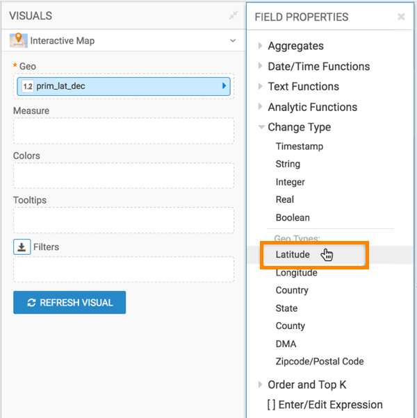
Under Measures, select prim-lat-dec and
drag it to the Geo shelf.
Cast this to the appropriate Geo Type: click the filed on the shelf, and in the
FIELD PROPERTIES menu and select Change Type > Latitude.
Under Measures, select prim_long_dec, and
drag it to the Geo shelf on the main part of the screen.
Cast this to the appropriate Geo Type: click the filed on the shelf, and in the
FIELD PROPERTIES menu and select Change Type > Longitude.
The two converted measurements have a (globe) icon tag. This
indicates that these fields can be 'understood' as geographic fields. For more
information, see Change type and Geo data type.
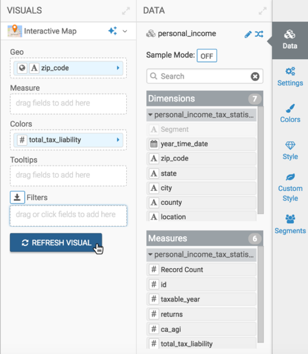
Under Dimensions, select feature_id, and drag
it to the Measures shelf.
Change the aggregation from sum(feature Id) to count(Feature
Id), by selecting Aggregates Count.
Add the following fields to the Filters shelf:
Field feature_class, set to Woods
Field sate_alpha, set to CA
Click REFRESH VISUAL.
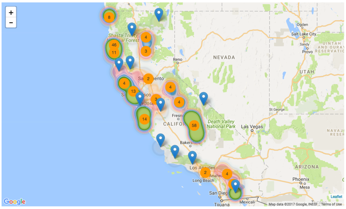
The visual appears. In this example, you can see a Google INEGI map.
In this representation, there is noticeable overlap on the Heatmap. However, you
can see the boundaries of each region by hovering the pointer over a section of the
map.
The total count of measurements in each region is in the circle inside the region.
This comes from the Cluster. Both Heatmap and Cluster are on my default.
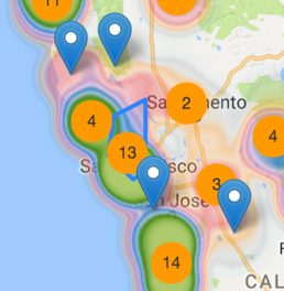
To see more detail, manipulate the map through magnification changes. You can also
click on the map and manually 'pan' it to the area of interest.
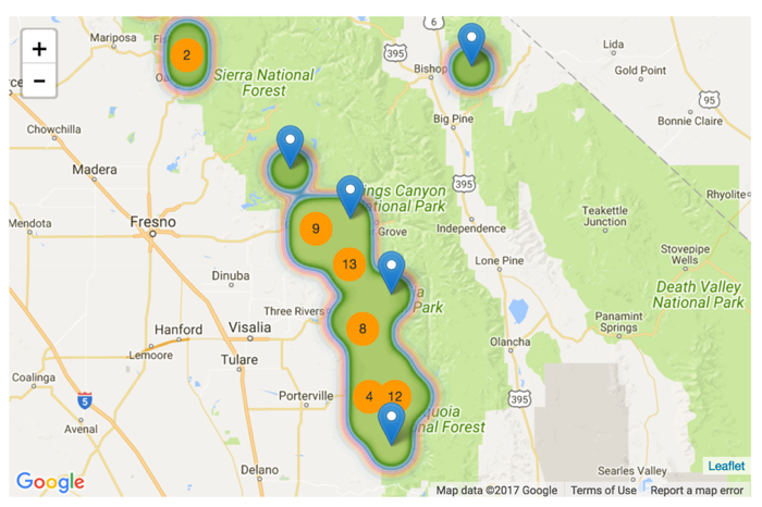
The following image shows that the regions automatically adjust into smaller sections,
and you can see both greater detail and more individual 'totals'.
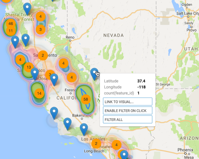
The 'interactive' part of this visual is that after clicking on a region to zoom-in and
reposition, to the level of an individual marker, you can enable click behavior.
Change the title to California Woods.
At the top left corner of the Dashboard Designer, click
SAVE.
There are many interesting visualization options. To change the map server, or the base map from
Google to Mapbox, see Changing the map server to interactive maps. To configure
the various options, see these topics: