Enabling continuous axis for date/time values
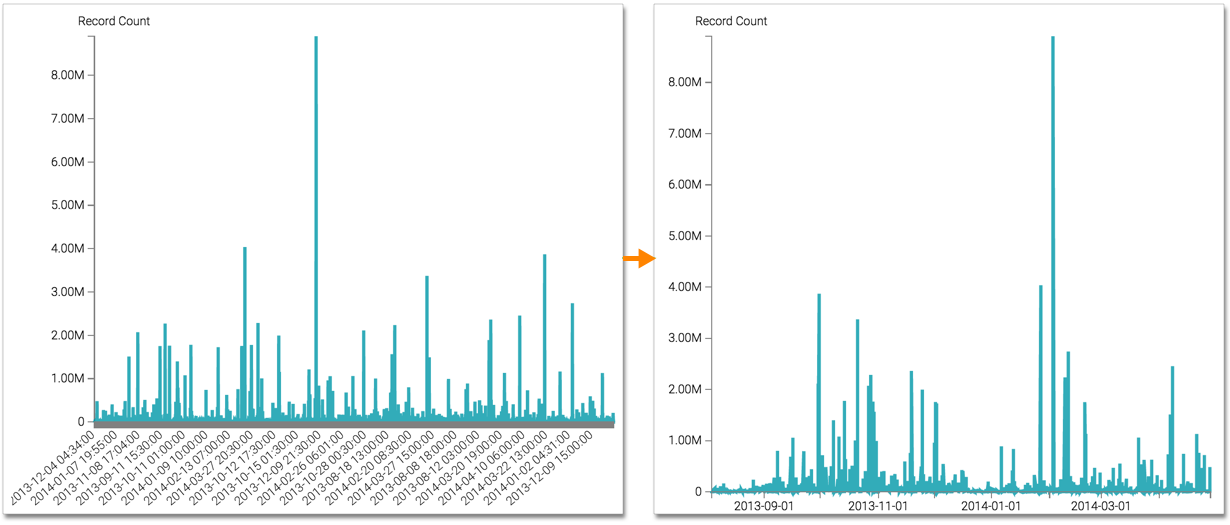
When using date/time measurements on the horizontal axis, values tend to be lengthy. This often distracts from the visual plot.
To use regular intervals, navigate to the Axes menu, and select the Auto-detect time columns to plot a continuous axis option.
You can see how enabling this feature results in a cleaner and clearer visual. Also, the plot produces conveniently rounded-up axis labels.


