In Scatter visuals, you can add trellises for comparing and contrasting data. To
discover variation within the dataset, to see both similarities and differences among
categorical subsets of data, it is very useful to see visuals for these categories of data side
by side. In Cloudera Data Visualization, this is very easy to do with the trellis option,
which is essentially a doubling down on one or both of the axes.
In the World Life Expectancy dataset, you can use un_region to
compare how life expectancy and GDP per capita vary in different geographic zones. For an
even greater degree of detail, you could use un_subregion.
The starting point of the following example is the 'World Population - Scatter with
Transition' visual developed in Adding transition animation to scatters.
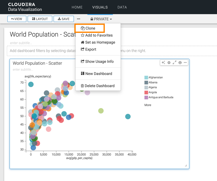
Click Clone to create a new visual that has the same properties
as the original.
Under Dimensions, select un_region and drag it
to the X Axis shelf.
Click REFRESH VISUAL.
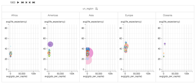
The Scatter visual refreshes, but this time you can see that it is divided into
five separate graphs, that correspond to the identified UN Regions: Africa, America,
Asia, Europe, and Oceania. There is a single animation control at the top, so when you
click Play, all UN Regions animate simultaneously.
After running the animation, you will notice that the horizontal axes extend far
beyond the necessary space for some of the areas. In particular, the GDP per Capita scale
seems too large for Africa.
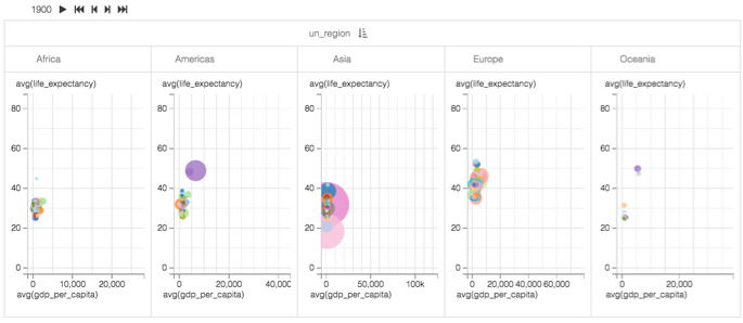
To have each graph use its own optimized scale for the horizontal axis, enable the
independent x-axis option, as described in Enabling independent axis scale,
and click REFRESH VISUAL.
You can see that each area has its horizontal scale.
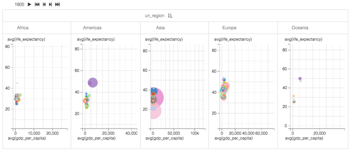
Optional: Similarly, choose the independent Y axis option. The differences in vertical scaling
are slight, but still noticeable.
Click the pencil/edit icon next to the title of the
visualization to enter a name for the visual.
In this example, the title is changed to 'World Population - Scatter with Transition
and Trellis'. You can also add a brief description of the visual as a subtitle below the
title of the visualization.
At the top left corner of the Dashboard Designer, click
SAVE.
This site uses cookies and related technologies, as described in our privacy policy, for purposes that may include site operation, analytics, enhanced user experience, or advertising. You may choose to consent to our use of these technologies, or