Prepare and use the dashboard
In this example, a new dashboard is created that displays both the source and the target visuals and filters are also used.
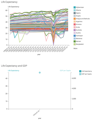
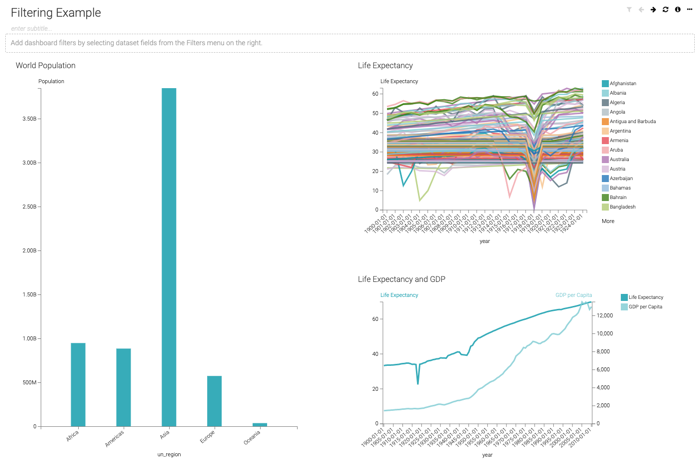
- Create a new dashboard, and add the three visuals to it.
In this example, the source visual is resized so it occupies the left side of the dashboard, while the target visuals share the right side of the dashboard.
- Click one of the bars of the source visual (in this example, Oceania), and select
the Filter All option.
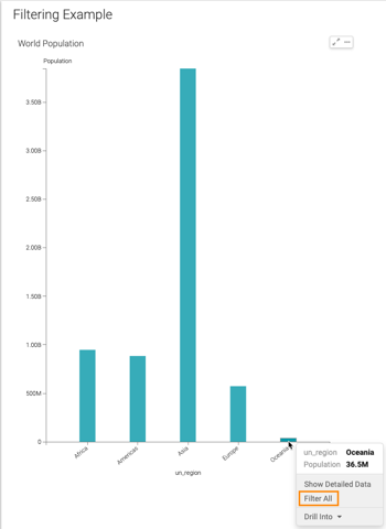
Cloudera Data Visualization refreshes the dashboard to show the target visuals that contain information about the selected
un_regiononly. You can see the value of the filters on each visual when you hover the pointer over them, or the value of the dashboard parameters when you hover over the (filter) icon.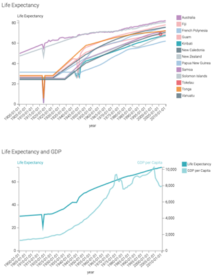
- Click that part of the line chart, and select Filter
All.
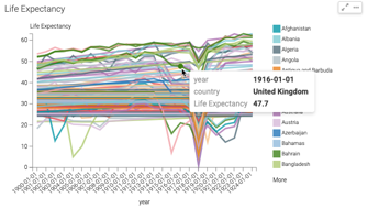
Cloudera Data Visualization refreshes the dashboard to show the effect on the other visuals. For example, the Life Expectancy and GDP shows that the GDP per Capita in Turkey for 1915 was 1.52k.