
Adding a filter to a sheet
Cloudera Data Visualization enables you to add filters to a sheet.
-
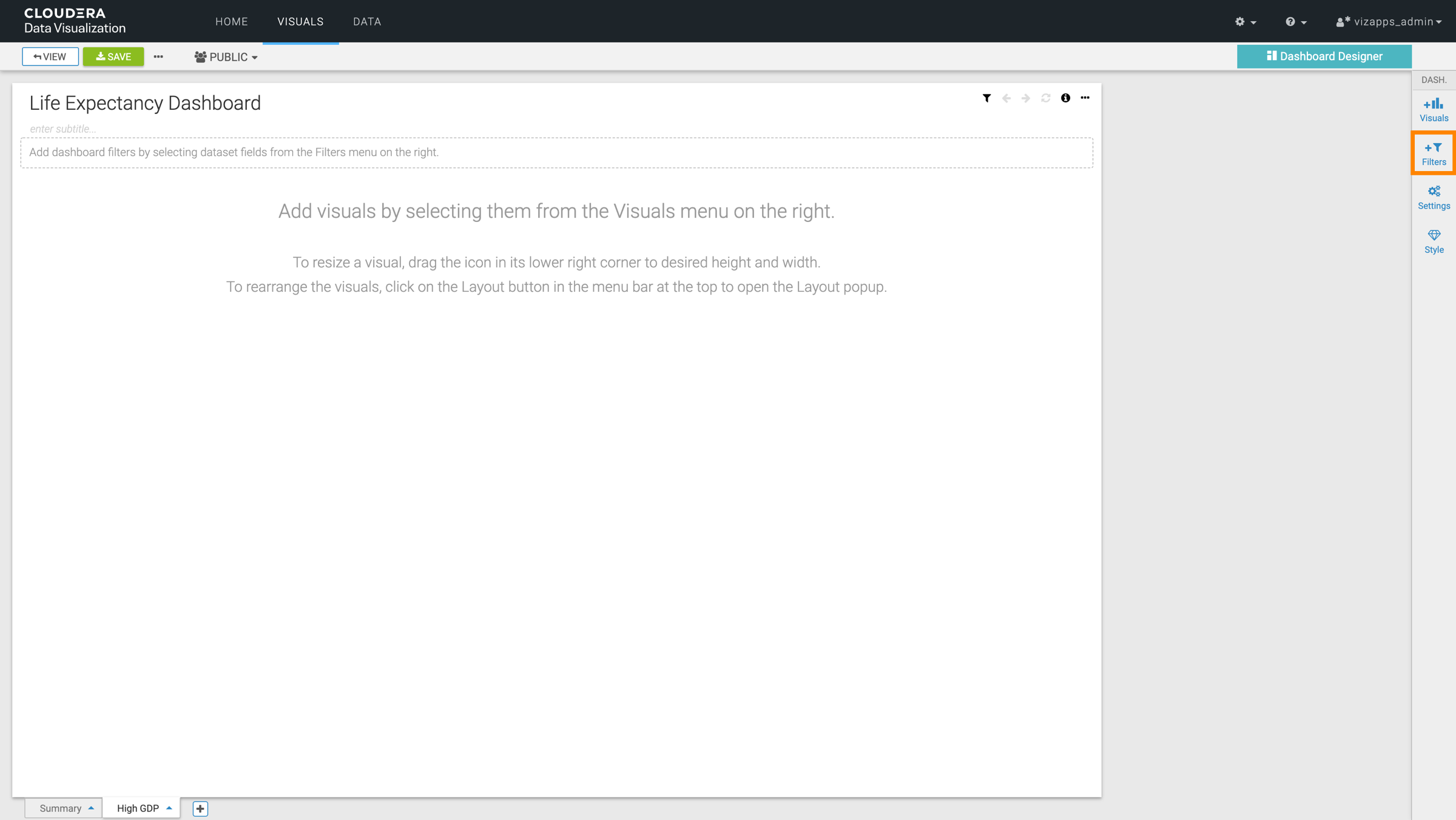
Select Filters in the Dashboard Designer side menu
bar on the right.
-
In the ADD FILTERS menu, configure your filter as you
need.
You can set the following options:
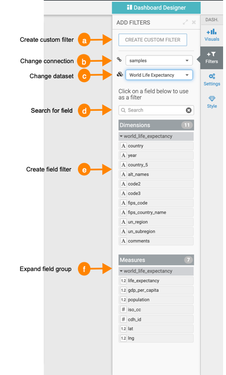
- Custom Filter
Click CREATE CUSTOM FILTER at the top of the Filters menu.
Cloudera Data Visualization adds a new filter to the filter area of the sheet. If you click the gear icon on the filer, the Settings window modal is displayed, where you can name the new filter and specify its value options, data handling, display, scope, and custom styling.
For information on new dashboard-specific filter scope options, see Configuring scope of dashboard filters.
- Connection
Cloudera Data Visualization supports access to multiple data sources in the same dashboard, so you can change the connection to access visuals based on different connections and dataset.
Click the name of the current connection, and select a different connection from the menu. When you change the connection, note that it changes the dataset to the first one that is available on that connection. This also updates the list of visuals that appear on the lower portion of the menu.
- Dataset
You can change the source dataset of the visuals that you plan to add to your dashboard sheet. The new dataset may be on the same connection, or on a different connection.
Click the name of the current dataset, and select a different dataset from the menu. This also updates the list of visuals that appear on the lower portion of the menu.
-
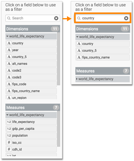
Search
For datasets built on very wide tables, this option helps you find the base field for your filter.
-
Field Filter
Clicking one of the fields in either Dimensions or Measures adds a basic filter based on that field into the filter area of the interface. Alternatively, you can also drag the field that you want to use as a filter and drop it into the filter bar on the sheet.
In this example, the filter country has been added. You can use it directly, or open the Settings menu, where you can rename the filter and specify its value options, data handling, display, scope, and custom styling.
-
Field Groups
For ease of viewing, you can collapse or expand the list of fields in either Dimensions, Measures, or both.
Additionally, datasets that represent two or more joined tables group the fields of each table separately. Clicking the name of the table under Dimensions or Measures toggles between expanding the list of these fields.
- Custom Filter
