Creating a visual

You can easily create new visual representations for your data in Cloudera Data Visualization.

The following steps demonstrate how to create a new visual.
  1. On the main navigation bar, click VISUALS.
  2. Click Create New > Dashboard to open a new, blank dashboard.

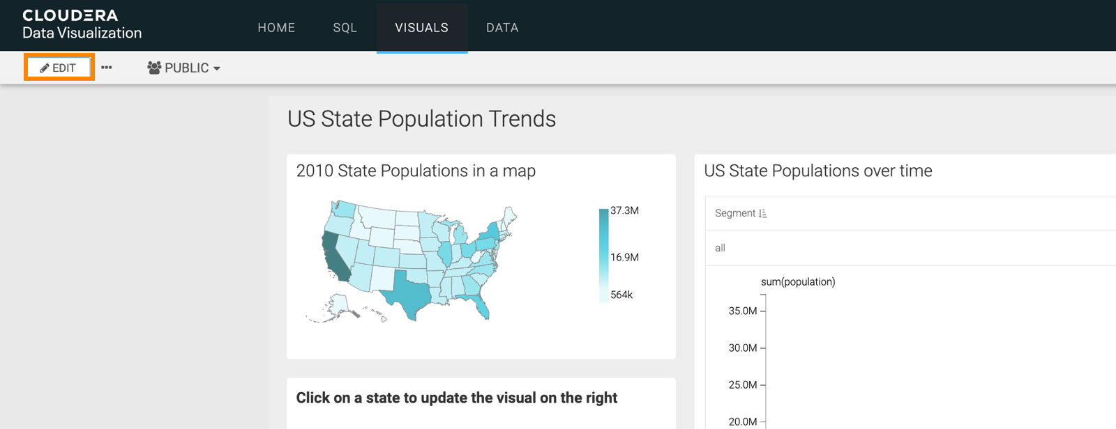
    If you already have an existing dashboard and you just want to add a new visual, open the dashboard and click EDIT to make changes to it.

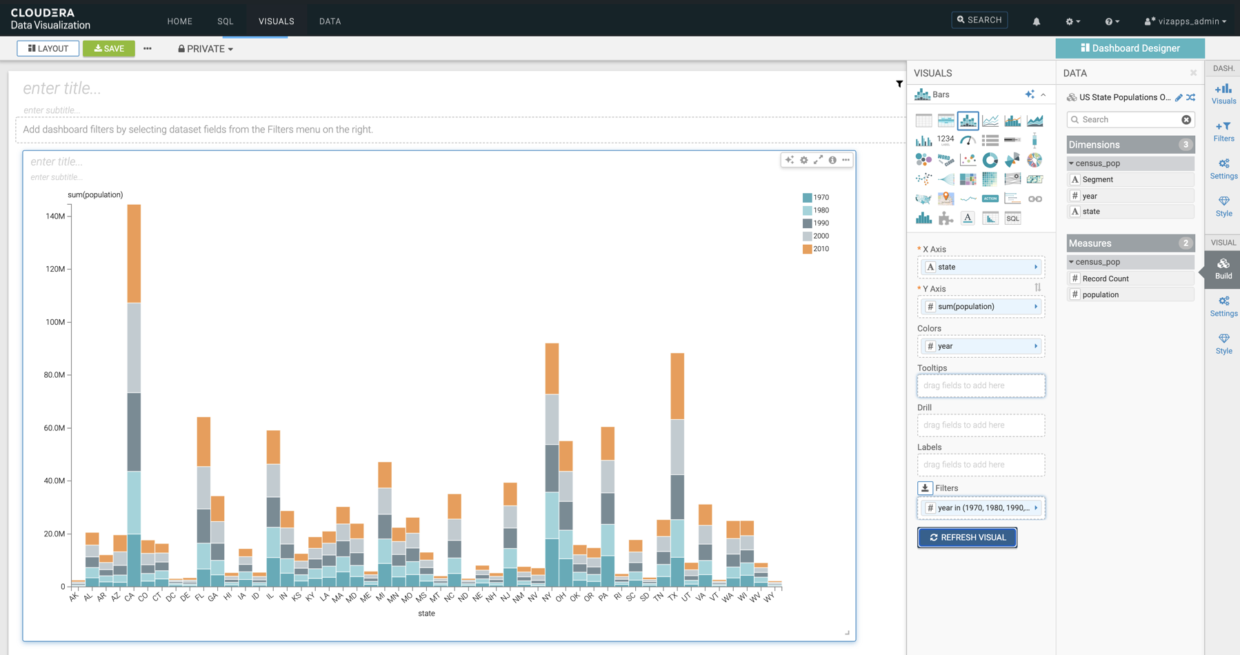
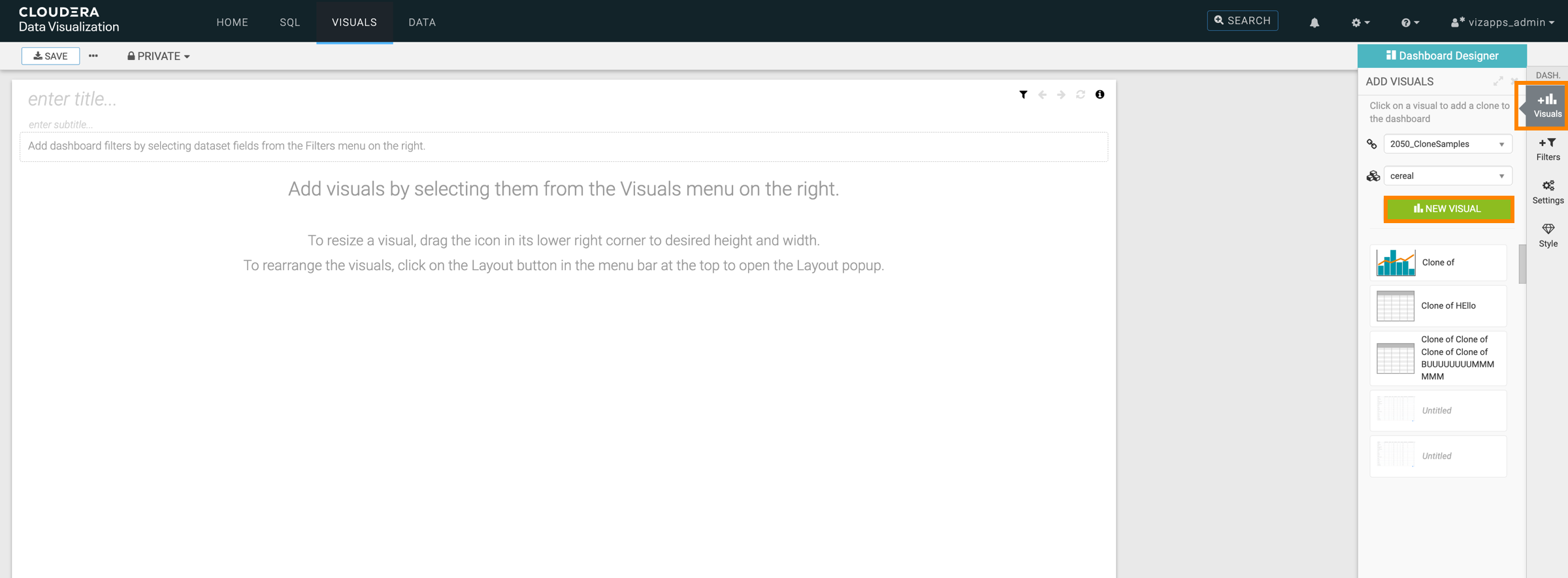
  3. In the Dashboard Designer interface, open the Visuals menu from the side menu bar and click NEW VISUAL.
  4. The Visual Builder appears.
    By default, a table visual is selected. For more information, see the Visual Builder overview.
  5. Choose the visual type you want to build.
    In this example, the Bars visual has been selected.
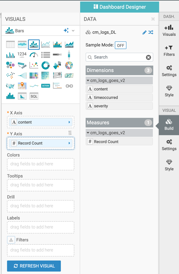
  6. Optional: 
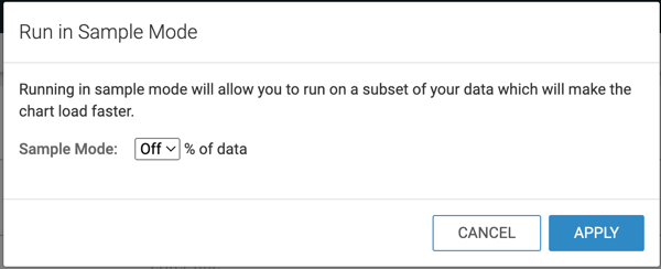
You can switch on Sample Mode for the visual you are building.
    With sample mode, you create the visual on a subset of your data to test it. You can define this subset as a percentage of the original data.
  7. Populate the shelves of the visual from the Dimensions and Measures fields:
    In this example, the following fields have been added:
    • state dimension on the X Axis shelf
    • population measure on the Y Axis shelf
    • year measure on the Colors shelf
    • year measure on the Filters shelf
  8. Click REFRESH VISUAL.
  9. Click the enter title... field and enter a name for the visual.
    • In this example the title 'Recent US Census Results by State' has been added.

    • You can also click the enter subtitle... field below the title of the visualization to add a brief description of the visual.

  10. Click SAVE at the top left corner of the Dashboard Designer.