Adding and removing legend
-
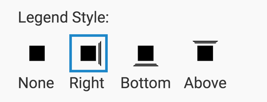
Legend is on by default. It appears on the right side of the visuals. To add a legend
below or above a visual, navigate to the Marks menu, and select the
appropriate Legend Style.
-
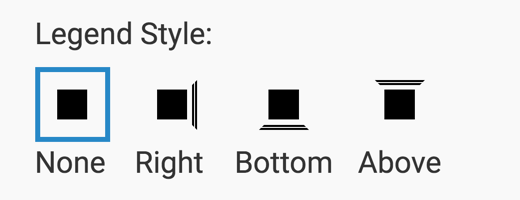
To remove the legend, select .
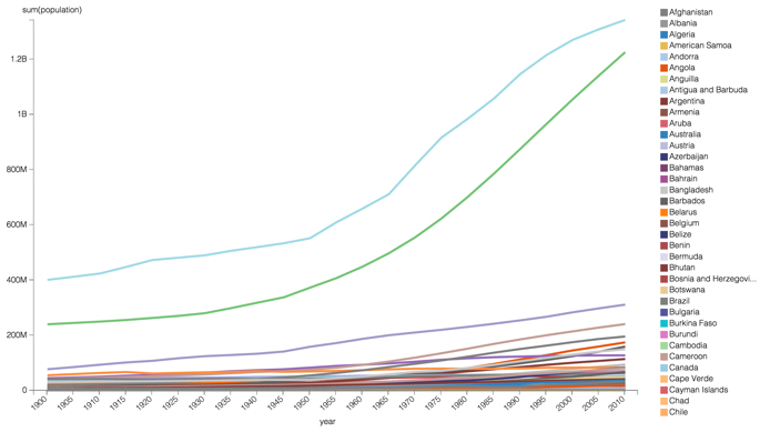
Here is an example of a line chart with a legend showing. The legend represents dimensions as distinct colors.
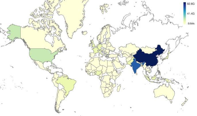
For graphs that map a continuum of values, such as choropleth maps, the legend shows a sliding scale of color and values at the minimum, median, and maximum.
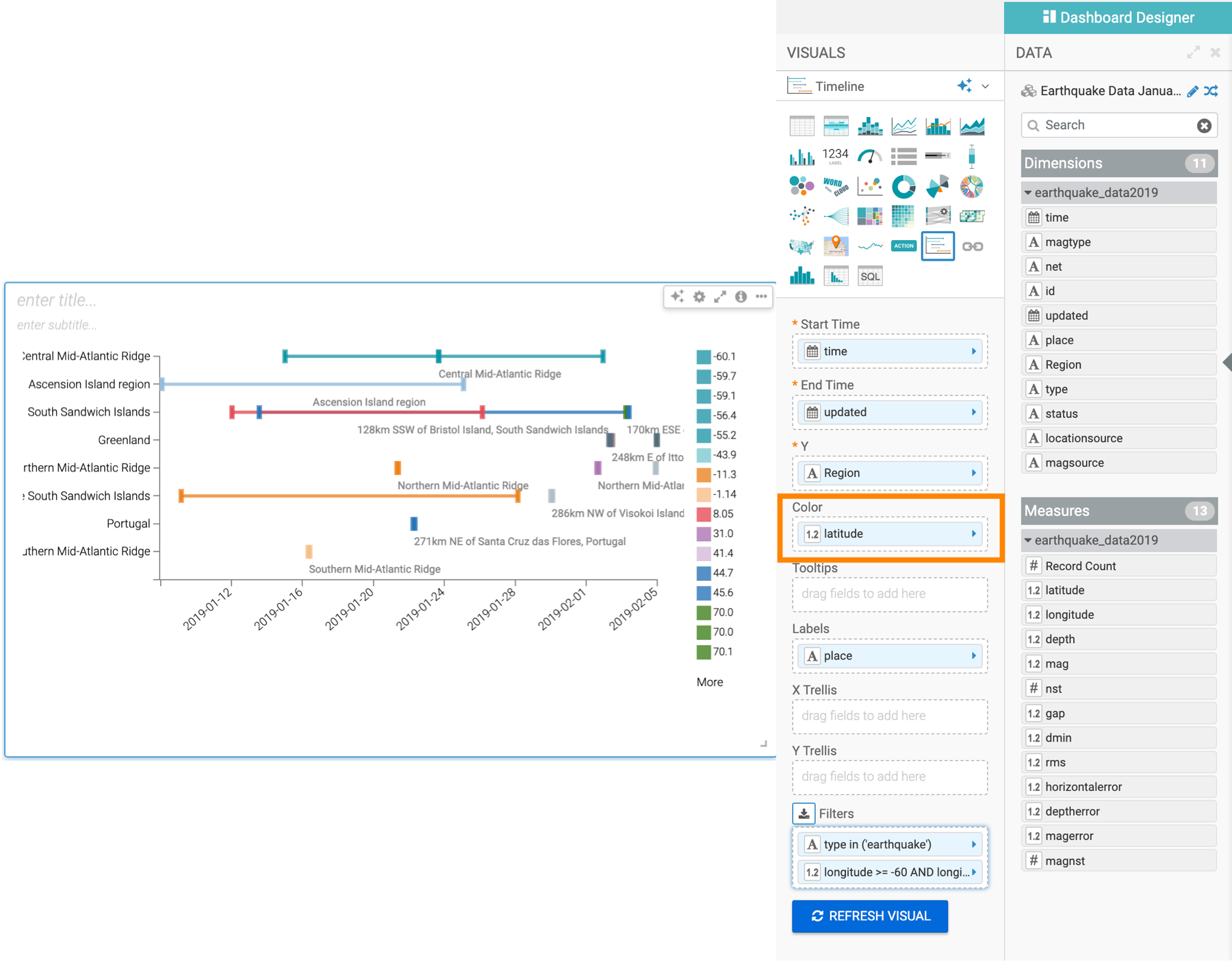
For timeline visuals, you can add a legend by adding a dimension to the color shelf. This example shows you a timeline where the different latitude values are marked by different colors, and the legend is displayed on the right side of the visual.