
Lines with dual axes
It is often enlightening to see related dimensions on the same line chart. It clearly shows both correlation and pattern. However, values may be measuring completely different things, or the range of values (scale) is too different to show both lines clearly. Cloudera Data Visualization offers a dual axis option for situations like these.
The following steps demonstrate how to create a Lines visual that uses a double axis. The example is based on the World Life Expectancy dataset.
-
Click REFRESH VISAL.
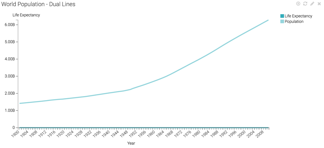
The Lines visual appears. You can see the linear plot of population and life expectancy, on the same axis.
It is impossible to see the values on the life expectancy line because the population line sets the scale for the Y axis.
In this case, the label does not correspond to the scale shown, because this information comes from the Y axis shelf.
-
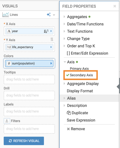
Select .
-
Click REFRESH VISUAL.
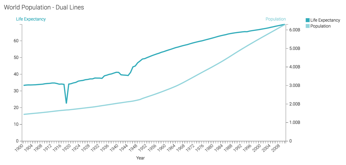
The two lines can now be seen clearly. There is a vertical axis both on the left and the right side of the visual. The linear plot of population and life expectancy are visible each on its own axis.
For convenience, the colors of the axis labels match the line.
Compare this approach with plotting multiple measures as trellised charts described in Trellis on measures.
