
Creating filters to control variable dimensions
-
Click CREATE CUSTOM FILTER.
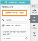
This creates a new filter in the filter area of the application, and opens the Settings modal window for that filter.
-
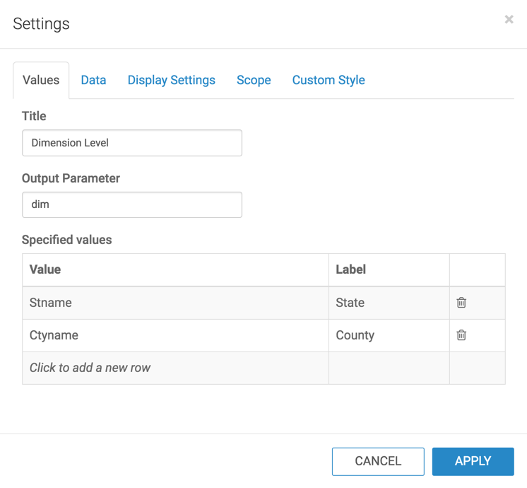
Switch to the Values tab and enter the following:
- Under Title, enter Dimension Level.
- Under Output Parameter, enter dim. Note that this is the parameter from Creating visuals with variable dimensions.
- Under Specified values, enter the following two rows:
- Value:
stname, Label: State - Value:
ctyname, Label: County
- Value:
-
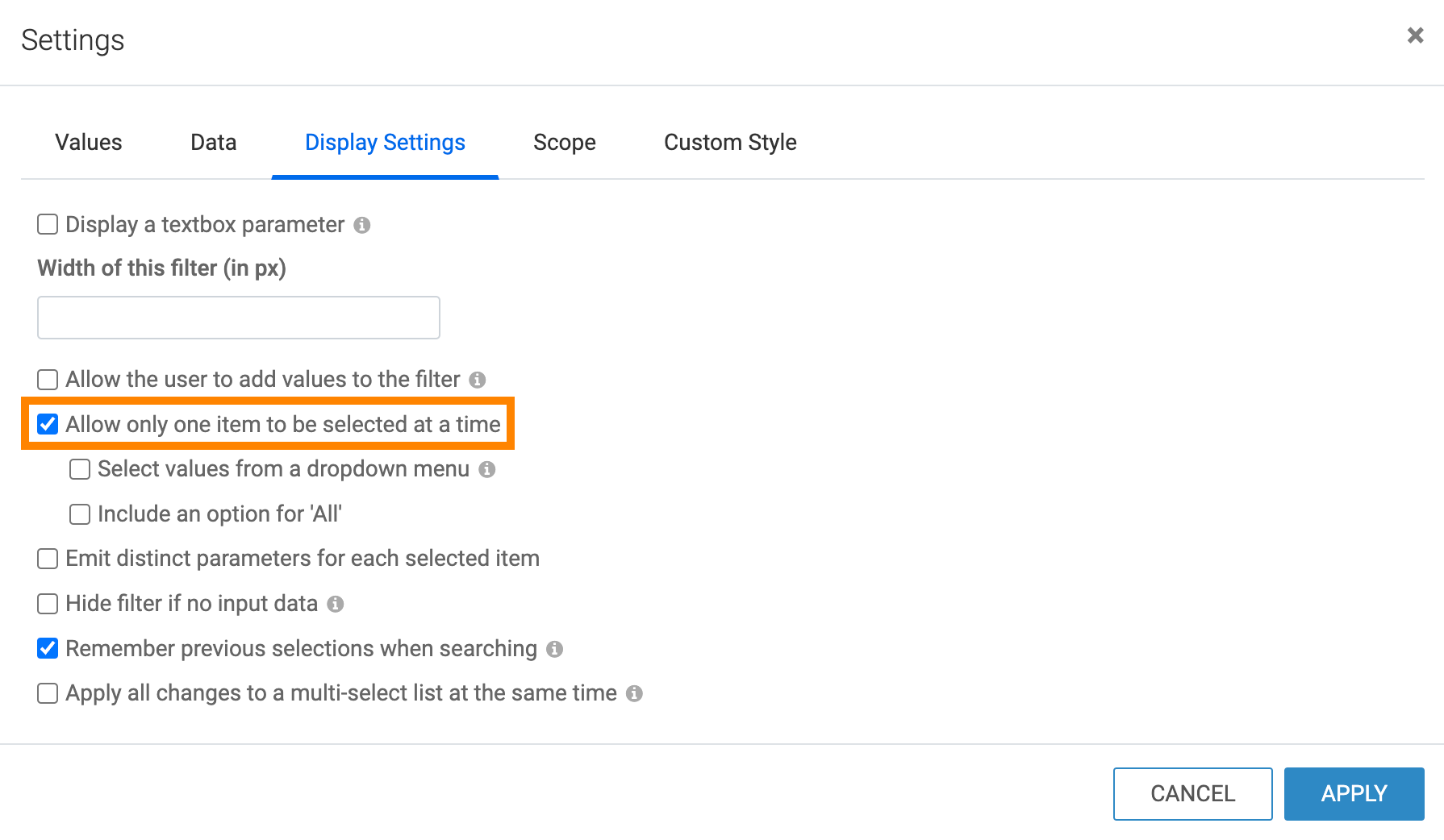
Switch to the Display Settings tab and select the
Allow only one item to be selected option.
-
In the Dimension Level filter, select
County.
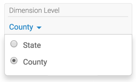
Note that now the title of the graph and the axis changed to use Ctyname.
You may also notice that your graph does not appear to have any bars. In this particular dataset, there are large differences among populations of various counties; a great majority has populations under one million, and a select few represent urban areas with extremely dense population.
In the application, scroll to the extreme right of the visual to see the graph.
If you want to check the status of parameters on this dashboard, hover the pointer over the Filter icon at the top right corner, and notice that they changed to
dim: Ctynameanddim.alias: County.
