Changing highlight of radius
For clearer appearance of the highlight in a visual, Cloudera Data Visualization enables you to adjust the highlight of the radius.
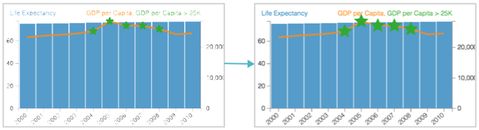
It applies to Combined Bar/Line charts.
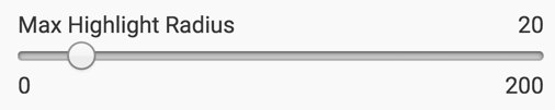
To change the size of a highlight, navigate to the Marks menu, and adjust the selector for the Max Highlight Radius option.
Note how the change of the maximum radius from 20 to 40 changes the appearance of the visual.