Cloudera Data Visualization enables you to create Box Plot visuals.
A Box Plot visual displays the distribution of data values. The box represents the bulk of
the data (25th percentile through 75th percentile), and whisker lines
represent statistical minimum and maximum values.
The following example uses the 2012 and 2013 API Scores for California Schools. The
School Performance dataset is used, which is built on a datafile that contains the
California School APIs from 2012 and 2013. The range of possible scores varies from a low of
200 to a high of 1000. The statewide API performance target for all schools is 800.
For an overview of shelves that specify this visual, see Shelves for box
plots.
Start a new visual based on the NYC Taxi Data dataset.
For instructions, see Creating a visual.
In the VISUALS menu, find and click Box
Plot.
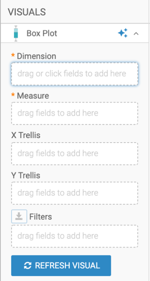
The shelves of the visual changed. They are now Dimension,
Measure, X Trellis, Y
Trellis, and Filters.
The mandatory shelves
are:
Dimension: you can specify one dimension for grouping the box
plot
Measure: you can specify the measurement for box plot
calculations
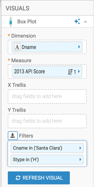
Populate the shelves:
Add the Dname (district name) field to the
Dimension shelf.
Add the Api13 (API obtained in 2013)field to the
Measure shelf.
Add the Cname (county name) field to the
Filters shelf, and select a single value. In this example,
Santa Clara is used.
Add the Stype (school type) field to the
Filters shelf, and select the value H, for
Highschool.
Optional: Alias the shelves.
Click REFRESH VISUAL.
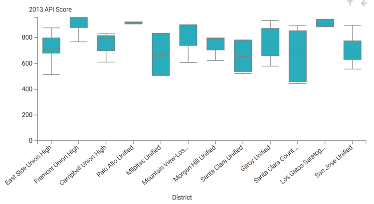
The new Box Plot visual appears.
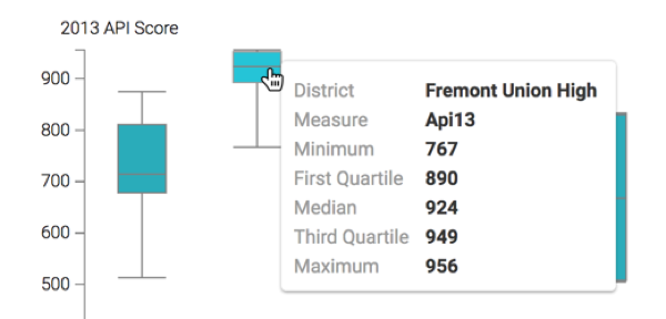
Hovering over a particular box plot distribution rectangle opens a Tooltip modal that
contains the statistical measures of that grouping, including the minimum, the first
quartile, the median/second quartile, the third quartile, and the maximum.
Click the pencil/edit icon next to the title of the
visualization to enter a name for the visual.
In this example, the title is changed to 'High School Performance - Box Plot'. You can
also add a brief description of the visual as a subtitle below the title of the
visualization.
At the top left corner of the Dashboard Designer, click
SAVE.
If you wish to generate a horizontal Box Plot visual, see the instructions in Making
box plots horizontal.
To adjust the Box Plot display, check all the available settings for this visual.
We want your opinion
How can we improve this page?
What kind of feedback do you have?
This site uses cookies and related technologies, as described in our privacy policy, for purposes that may include site operation, analytics, enhanced user experience, or advertising. You may choose to consent to our use of these technologies, or