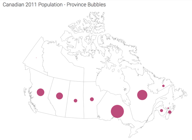
Cloudera Data Visualization Map visuals enable you to show measurements, as
bubbles, over a map of Canadian Provinces and Territories. Bubble maps display up to two
measurements simultaneously: as the color of the bubble, and as the relative size of the
bubble.
A map of Canada shows a comparison of measurement values among Canadian Provinces and
Territories. The following steps demonstrate how to create a new choropleth map of Canada.
This example uses the Canadian Census dataset, constructed from the
canada_census_population_dwellings.csv and
ca-postal-codes.csvfiles, and joined of the fields fsa
and Postal Code, respectively. For more information, see Canadian
census, Adding data, and Creating datasets.
Start a new visual based on the Canadian Census dataset.
For instructions, see Creating a visual.
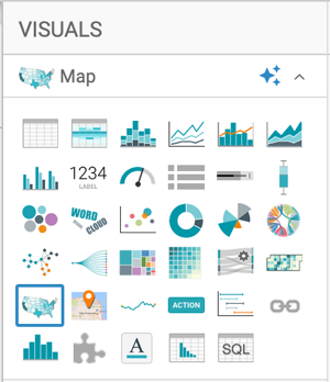
In the VISUALS menu, find and click
Map.
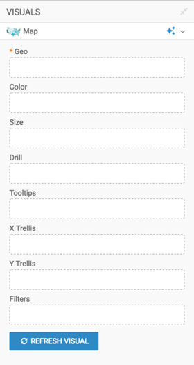
The shelves of the visual changed. They are now Geo,
Color, Size, Drill,
Tooltips, X Trellis, Y
Trellis, and Filters. The only mandatory shelf for
map visuals is Geo.
Populate the shelves from the DATA menu:
Under Dimensions, select Province from the
table ca_postal_codes, and add it to the Geo
shelf.
Under Measures, select Population 2011 from
table canada_census_population_dwellings, and add it to the
Measures shelf.
Specify the use of Canada Map View in the Settings > Map interface.
For instructions, see Map view.
Click REFRESH VISUAL.
Change the display of marks to bubbles as described in Displaying bubbles on
maps.
Change the mark size range to 1-30 as described in Changing the mark size
range.
Optional: You can change or simply reverse the color palette to suit your needs.
For instructions, see Change color palette of visuals and Reverse
color palette of visuals.
Optional: Alias the fields as necessary.
For instructions, see Alias.
Optional: Enable panning and zooming option, as described in Customizing zoom.
Optional: Change the color palette, as described in Change color palette of
visuals.
Click the pencil/edit icon next to the title of the
visualization to enter a name for the visual.
In this example, the title is changed to 'Canadian 2011 Population - Province Bubbles'.
You can also add a brief description of the visual as a subtitle below the title of the
visualization.
At the top left corner of the Dashboard Designer, click
SAVE.