
Cloudera Data Visualization homepage
Cloudera Data Visualization enables you to explore data and communicate insights across the whole data lifecycle by using visual objects.
When you log into Cloudera Data Visualization, you are taken to the HOME screen, which is the starting point to your data visualization journey. It displays recent views, favorites, and the application’s most-viewed content. You can start exploring sample dashboards or the in-tool Get Started guide.
Clicking HOME on the main navigation bar always takes you to the homepage.
The default Cloudera Data Visualization homepage has the following main parts:
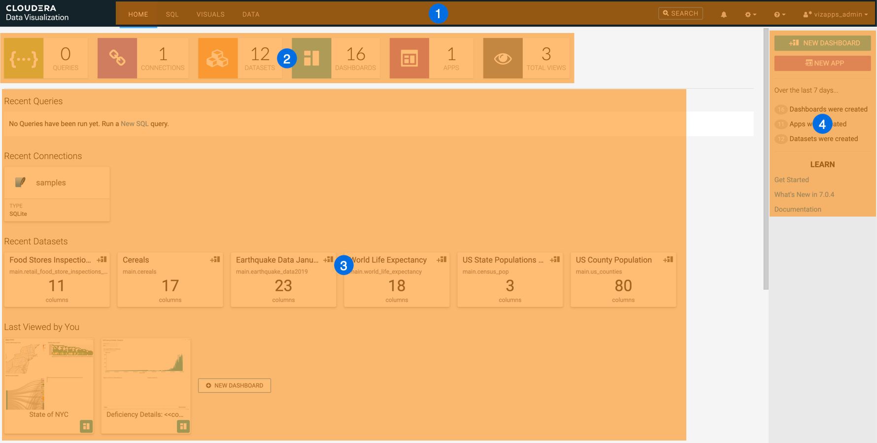
- Main navigation bar
- Statistics banner
- Preview area
- Homepage side menu bar
For information on how to customize the homepage, see Custom Homepages.
Main navigation bar

-
The HOME interface is described in this topic.
- The SQL interface to manually build queries.
-
The VISUALS interface is for building visuals, dashboards, and applications. For more information, see Visuals interface.
-
The DATA interface for access to datasets, connections, and the Connection Explorer. For more information, see Data interface.
-
The search bar for natural language search. It is only visible if search is enabled in the Site Settings.
-
The notification center that contains application, server and site settings errors and warnings.
All users can see browser-level errors that might be affecting Cloudera Data Visualization. Additionaly, for admin users and users with permission to view activity logs, webserver errors (such issues with applying advanced site settings) are also available in the notification center.
-
The Settings menu provides access to various setting options:
- With Set Homepage, you can define a custom homepage.
- With Job Status, you can check job statuses.
If you have administrative privileges, you can use Site Administration to make changes to the following functionalities:- Activity Log displays all recorded events generated by the data processing requests.
- Users & Groups helps you to manage accounts of all users and user groups, and grant them varying privileges and levels of access.
- Manage Roles helps you to define roles as a set of privileges, and assign them to users or user groups.
- Manage API Keys helps you to authenticate with the system to perform some of the administrative tasks.
- Email Templates helps you to create separate email templates for communicating with various stakeholders, departments, or users who have clearly defined roles in the organization.
- Custom Styles helps you to apply styling options for the appearance of visuals and applications.
- Custom Colors helps you to define custom color palettes for styling visuals and applications.
- Custom Dates helps you to define custom sets of date ranges and anchor them to a specific date and time.
- Static Assets helps you to save and manage images, CSS files, and JS files as static assets and use them across all reports to standardize the appearance and behavior of visuals and dashboards.
- Site Settings helps you to configure site-wide settings and settings at the level of individual visuals, dashboards, and filters.
-
Help provides you with the following links:
- What's New in
- - a summary of the major new features and improvements of the latest release
- Documentation
- - the official Cloudera Data Visualization documentation
- Cloudera Support Hub
- - access to the support and professional services portal on MyCloudera
-
The user management menu includes password change and logout options.
It also provides information on your last login date. The username displayed identifies the current user. The user icon can include small, additional icons to show if the current user is an admin or an LDAP/SSO user:Admin user SSO autheticated user Admin and SSO autheticated user Regular user 


Statistics banner
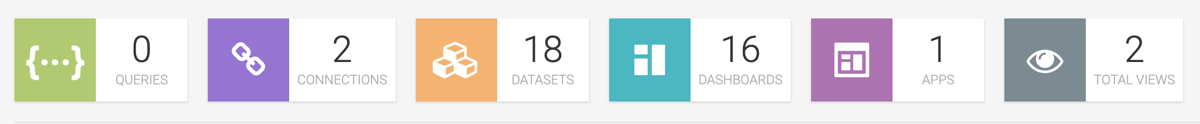
This pane shows the number of QUERIES, CONNECTIONS, DATASETS, DASHBOARDS, and APPS that you can access in your Cloudera Data Visualization instance. It also shows you the number of TOTAL VIEWS. You can click each tile to explore further details. By clicking the different tiles you can quickly access recent queries, data connections, and datasets, and can also open your their dashboards and applications.
If you click TOTAL VIEWS, you are directed to the Daily Usage tab of the Activity Log interface, where you can check the list of all activities, users, and dashboards in your Cloudera Data Visualization instance. You can adjust the time interval you want to review (the default is 30 days), and you can download the data in CSV format.
Preview area
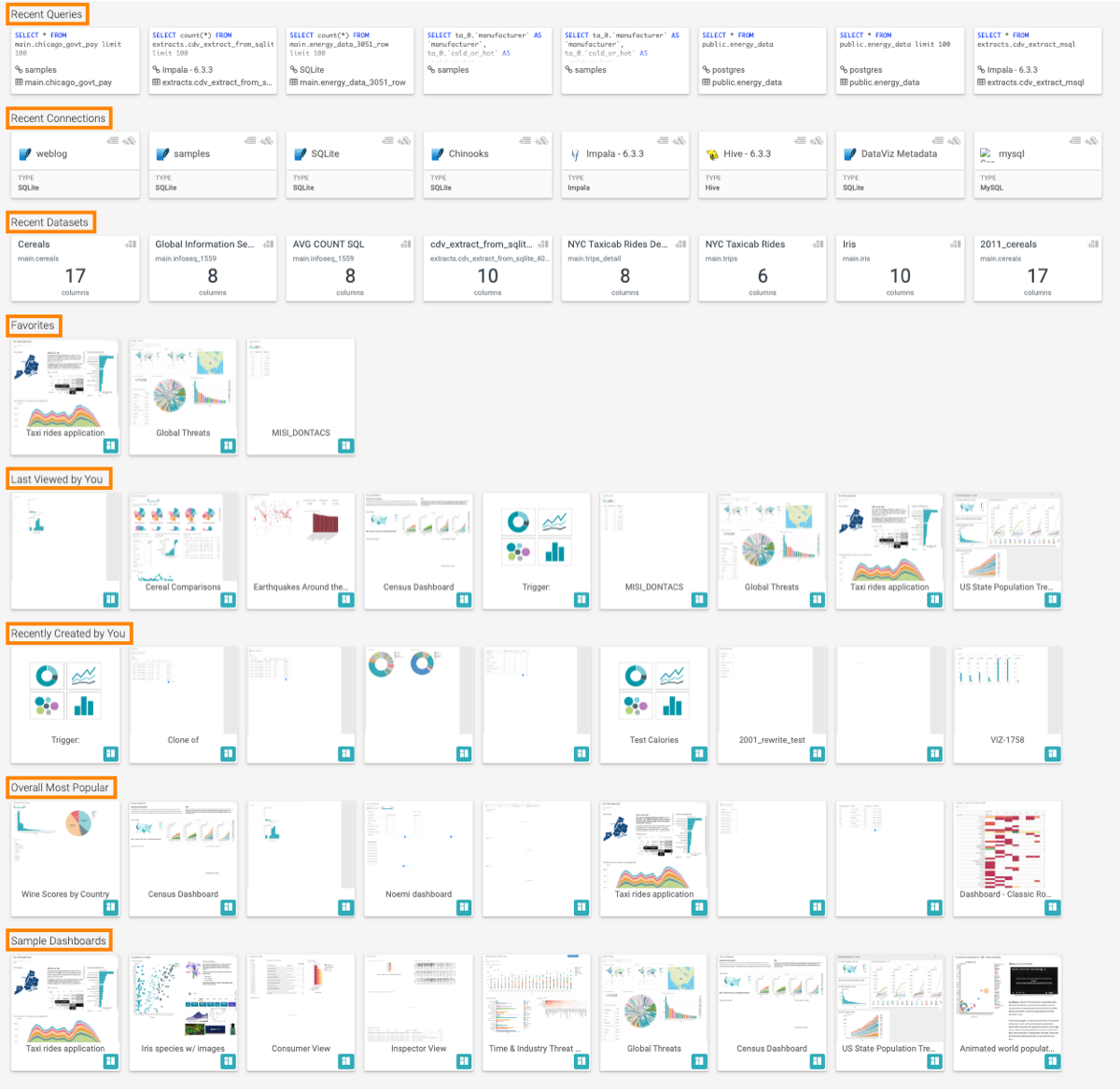
- Recent queries
- Recent connections
- Recent datasets
- Favorites
- Items you last viewed
- Items you recently created
- Overall most popular items
- Sample dashboards
You can click any of the tiles to explore the selected connection, dataset, visual, or dashboard.
For instructions on how to add a dashboard to your favorites, see Adding a dashboard to favorites. Alternatively, you can access your bookmarked dashboards by clicking VISUALS on the main navigation bar and then clicking My Favorites in the side menu bar.
Homepage side menu bar
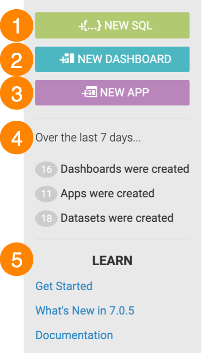
- The NEW SQL button takes you to the Data Connection interface, where you can compose a SQL query.
- The NEW DASHBOARD button takes you to the Dashboard Designer interface, where you can create new dashboards and visuals.
- The NEW APP button takes you to the App Designer interface, where you can build and style custom BI applications from existing dashboards and visuals.
- Over the last 7 days... includes statistics on how many dashboards, apps, and datasets have been created.
- In the LEARN section, you can find the following information:
- The Get Started link points to help content embedded in the tool.
- The What's New in link opens a modal window showcasing new features.
- The Documentation link opens this library.
