KPI

CDP Data Visualization enables you to create Key Performance Indicator (KPI) visuals. KPI visuals return values to emphasize particular areas of dashboards or applications. They can be used to provide section titles, totals for segmented data, draw attention to aggregation results, and so on.

The following steps demonstrate how to create a new KPI visual representation on the Customer Value Analysis dataset. This dataset is based on sample data previously imported into CDP Data Visualization.

For information on customization options, see KPI settings. For an overview of shelves that specify this visual, see Shelves for KPI visuals.

  1. Start a new visual based on the Customer Value Analysis dataset.
    For instructions, see Creating a visual.
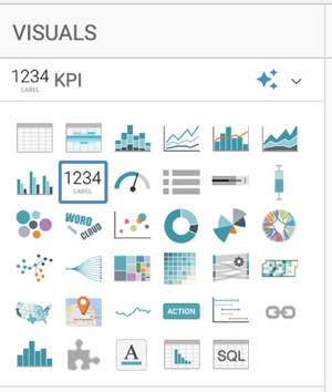
  2. In the VISUALS menu, find and click KPI.

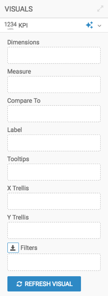
    The shelves of the visual changed. There are no mandatory shelves for KPI visuals. Instead, the primary measure appears either on the Dimension or the Measure shelves.

  3. Populate the shelves from the available fields (Dimensions, Measures) in the DATA menu.
    1. From Measures, select Customer Lifetime Value and place it on the Measure shelf. Ensure that the aggregate is set to Average.
    2. From Measures, select Total Claim Amount and place it on the Compare To shelf. Ensure that the aggregate is set to Average.
    3. From Measures, select Record Count and place it on the Label shelf.
    4. Change the expression on the shelf to the following calculation:
      concat("Records: ", cast(sum(1) as string)) as 'Record Count'

      The exact expression may be different, depending on the target data repository.

    5. Place the fields Gender and Marital Status (both under Dimensions) on the X Trellis and Y Trellis shelves.
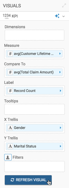
  4. Click REFRESH VISUAL.

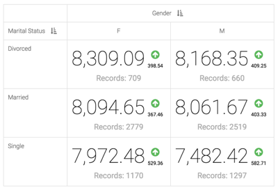
    The KPI visual appears.

  5. Click the (pencil) icon next to the title of the visualization to edit it, and change the title to KPI by Gender and Marital Status.
  6. At the top left corner of the Dashboard Designer, click SAVE.