Cloudera Docs

Customizing axes for visuals

Several display options may be managed from the Axes menu, depending on the chart type in the visual.

To get to the options in the Axes menu, follow these steps:

  1. On the right side of Visual Designer, click the Settings menu.
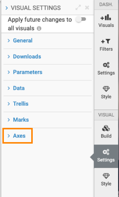
  2. In the Settings menu, click Axes.
  3. Select one of the options:
  • Changing the axis scale
  • Changing the axes scale for radial graphs
  • Enabling gridlines
  • Enabling continuous axis for date/time values
  • Changing the padding on the X axis
  • Changing the padding on the Y axis
  • Starting aggregate scale at zero
  • Changing the min/max of the aggregate scale
  • Showing or hiding axis labels
  • Changing the size of dimension text
  • Showing or hiding an axis
  • Reversing the axis scale
  • Dynamically sizing a graph
  • Setting maximum row label length
  • Setting column label length
  • Enabling a continuous X axis
  • Changing scale of a continuous X axis
  • Enabling a continuous Y axis
  • Changing scale of a continuous Y axis
  • Enabling a continuous axis on dimensions
  • Changing the scale of a continuous axis on dimensions
Parent topic: Customizing visual settings