Line visuals with dual axes
It is often enlightening to see related dimensions on the same line chart; it clearly shows both correlation and pattern. However, values may be measuring completely different things, or the range of values (scale) is too different to show both lines clearly. Cloudera Data Visualization offers a dual axis option for situations like these.
The following steps demonstrate how to create a line visual that uses a double axis; it is
based on dataset World Life Expectancy [data source
samples.world_life_expectancy].
-
Click Refresh Visual.
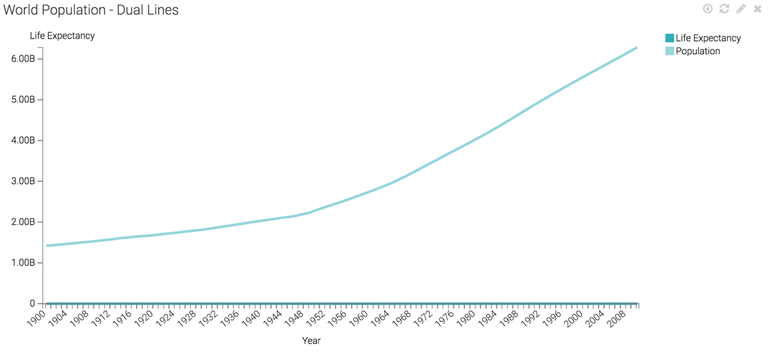
The line visual appears.
It is impossible to see the values on the life expectancy line because the population line sets the scale for the Y axis.
In this case, the label does not correspond to the scale shown, because this information comes from the Y axis shelf.
-
On the Colors shelf, on
sum(population)field, click the Down arrow icon, select Axis, and then select Secondary Axis.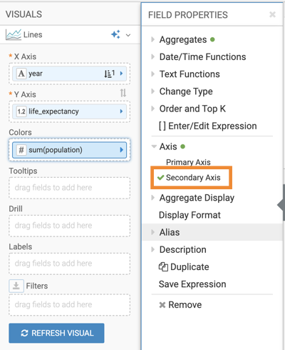
-
Click Refresh Visual.
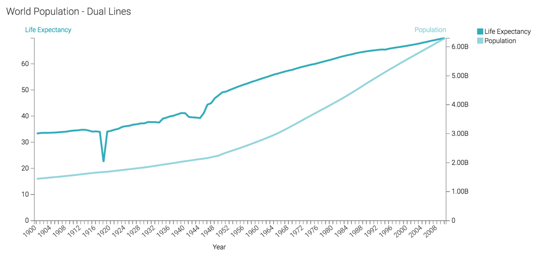
The two lines can now be seen clearly.
There is now a vertical axis both on the left and the right side of the visual. For convenience, the color of the axis labels match the line.