Using the trellis option with independent scale
Cloudera Data Visualization enables you to create a new trellised Areas visual with independent aggregate axes.
- Create the World Population - Area visual as described in Areas.
- Create the World Population - Area Trellis as described in Enabling the trellis option.
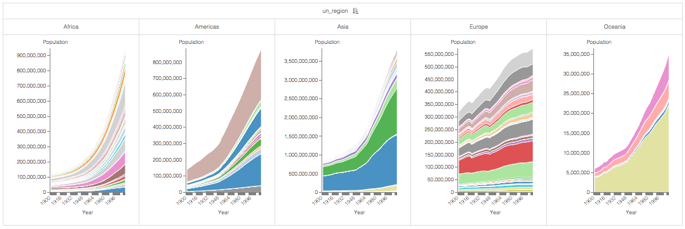
Trellis charts are very powerful visualization tools. However, they do not work well when one chart contains values that are several orders of magnitude larger than in the other charts. The charts that represent segments with smaller values are very difficult to interpret. You can mitigate this problem by enabling independent axis.
This example uses the visual World Population - Area Trellis from Enabling the trellis option, to create trellis charts with independent scale.
The following steps show you how to create a new trellised area chart with independent aggregate axes on the World Life Expectancy dataset.
-
Click REFRESH VISUAL.
The updated trellised area chart appears.