Cross tabulation
Cross Tabulation visual is a tool that allows you to compare the relationship between two variables in table format. Cloudera Data Visualization enhances the understanding of relative value size by assigning more saturated colors to the table fields with larger values.
The following steps demonstrate how to create a new Cross Tabulation visual on the World Life Expectancy dataset. For an overview of shelves that specify this visual, see Shelves for cross tabulation.
-
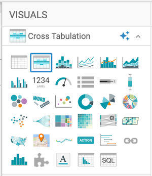
In the VISUALS menu, find and click Cross
Tabulation.
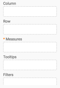
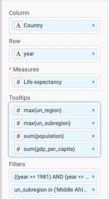
The shelves of the visual changed. They are now Column, Row, Measures, Tooltips, and Filters. The Measures shelf is mandatory.
- Change the aggregate of the 'life_expectancy' field from
'sum(life_expectancy)' to 'avg(life_expectancy)'.
- On the Measures shelf of the visual, click the caret-right icon to the right of the field.
- In the FIELD PROPERTIES menu, click the caret-right icon next to Aggregates to open a drop-down menu..
- From the list of aggregate functions, select Average.
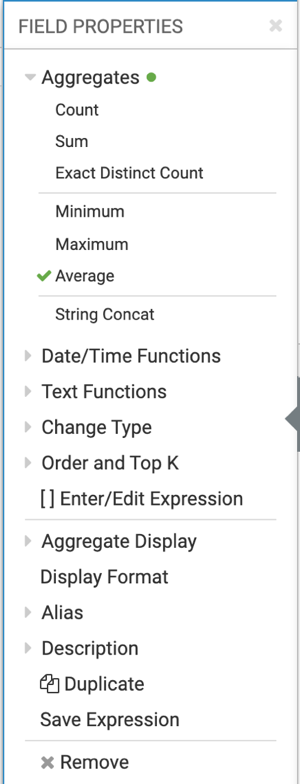
- Click the x icon at the top of the FIELD PROPERTIES menu to close it.
The shelf now contains the modified field with the 'avg()' aggregation function.
Alternatively, you can change the aggregation at the level of the dataset, as described in Changing field aggregation.
- Click REFRESH VISUAL.
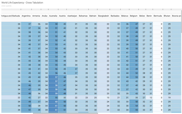
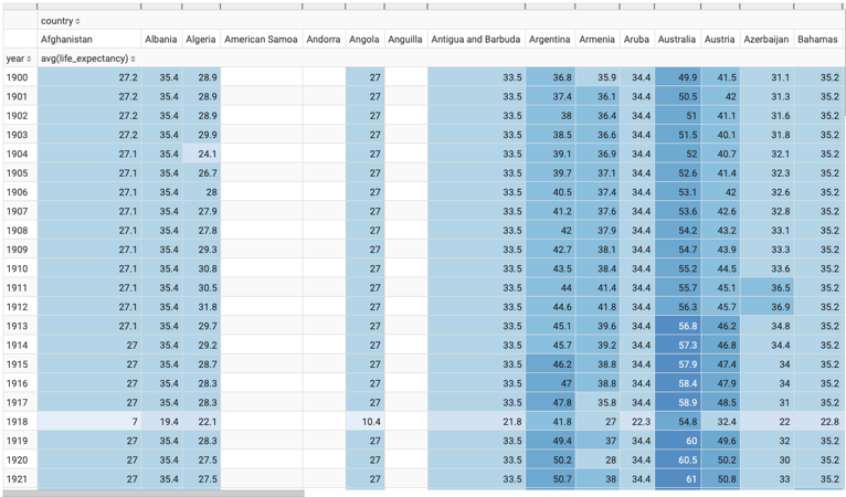
The updated Cross Tabulation visual appears. It shows life expectancy information for each row of the dataset. By default, Cross Tabulation visuals show smaller values in light colored cells, and larger values in darker colored cells.
- Click REFRESH VISUAL.
The updated Cross Tabulation visual appears. It demonstrates the relative size of populations by assigning a progressively more saturated color to represent increasingly larger values.