Cloudera Data Visualization enables you to create Pie charts.
Pie charts are circular statistical graphics that show numerical proportion through
relative size of slices; the arc length of each slice is proportional to the quantity it
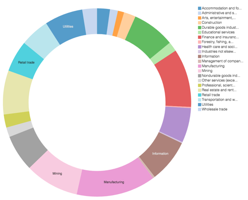
represents. In Cloudera Data Visualization, pie charts use a default 'doughnut'
representation. However, you can change them to the more traditional closed pie
configuration by controlling the arc width of the circle, as described in Changing arc
width.
The following steps demonstrate how to create a new Pie visual on the Capital
Expenditure by Industry dataset. You must first create this dataset, following the
steps described in Creating datasets.
For an overview of shelves that specify this visual, see Shelves for pie
visuals.
Start a new visual based on the Capital Expenditure by Industry dataset.
For instructions, see Creating a visual.
In the VISUALS menu, find and click
Pie.
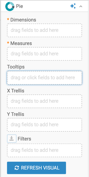
The shelves of the visual changed. They are now Dimensions,
Measures, Tooltips, X
Trellis, Y Trellis, and
Filters. Both Dimensions and
Measures are mandatory.
Populate the shelves from the available fields (Dimensions and
Measures) in the DATA menu.
Under Dimensions, select industry and drag
it to the Dimensions shelf.
Under Measures, select expenditure and drag
it to the Measures shelf.
Click REFRESH VISUAL.
The Pie visual appears.
Click the pencil/edit icon next to the title of the
visualization to enter a name for the visual.
In this example, the title is changed to 'Capital Expenditures - Pie'. You can also add
a brief description of the visual as a subtitle below the title of the
visualization.
At the top left corner of the Dashboard Designer, click
SAVE.
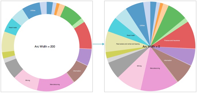
Optional: Adjust the arc width to close the hole in the middle of the 'doughnut'.
From the visual Settings menu, select the
Marks tab, and set Arc Width to
0.
The default arc width is 80.Figure 1. Closing the Hole; Changing Arc Width from 80 to 0
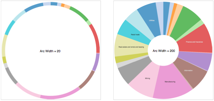
You can also experiment with changing the thickness of the 'doughnut'. See
Changing arc width for details on how to adjust the thickness of the
'doughnut'.
Figure 2. Contrasting Arc Widths: 20 and 200
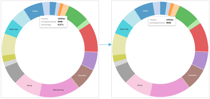
Optional: You can adjust the default percentage reporting inside the Tooltip.
From the visual Settings menu, select the
Tooltip.
Change the Label for Percentage to 'Percent of Total' and
the Decimals included in percentage to '3'.