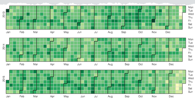
Cloudera Data Visualization enables you to create Calendar Heatmap visuals. A
Calendar Heatmap uses colored cells, typically in a monochromatic scale, to show relative
number of events for each day in a calendar view. Days are arranged into columns by week and
grouped by month and years. This enables you to quickly identify daily and weekly patterns,
and to recognize anomalies.
The following steps demonstrate how to create a new calendar visual on the SFPD
Incidents dataset, based on data previously imported into Cloudera Data Visualization from the
sfpd_incidents.csv.zip datafile.
For an overview of shelves that specify this visual, see Shelves for calendar
heat maps.
Start a new visual based on the SFPD Incidents dataset.
For instructions, see Creating a visual.
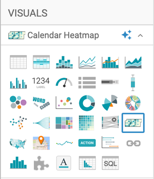
Select Calendar Heatmap in the
VISUALS menu.
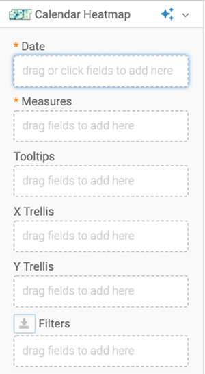
The shelves of the visual changed. They are now
Date (mandatory), Measures
(mandatory), Tooltips, X Trellis,
Y Trellis, and Filters.
To show specific items, populate the shelves from the available fields
(Dimensions, Measures) in the
DATA menu.
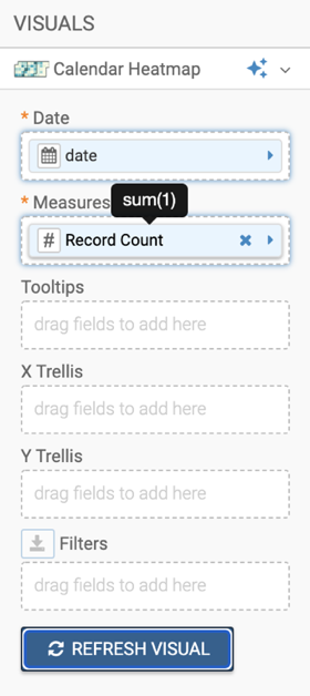
Under Dimensions, select date
and drag it to the Date shelf.
Under Measures, select Record
Count and drag it to the Measures
shelf.
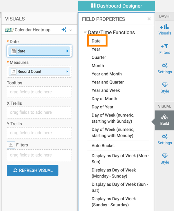
The field on the Date shelf should have a calendar icon
to indicate that it is in the Date/Time category of data types. If the field is
not automatically recognized as a date data type, convert it.
On the Date shelf of the visual, click the
date field, select Date/Time Function > Date.
Click REFRESH VISUAL.
The default calendar heat map visual appears.
Change the title of the visual to SFPD Incidents - Calendar Heat
Map.
Click SAVE at the top left corner of the
Dashboard Designer.
This site uses cookies and related technologies, as described in our privacy policy, for purposes that may include site operation, analytics, enhanced user experience, or advertising. You may choose to consent to our use of these technologies, or