Changing colors for KPI visuals
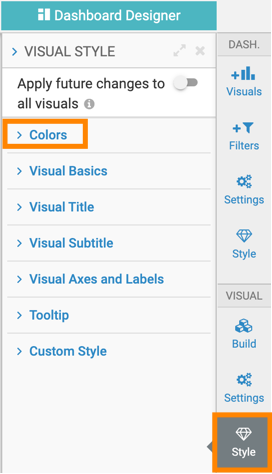
Click the Style menu on the right side of the Dasboard Designer.
Click Colors to open the drop down menu.
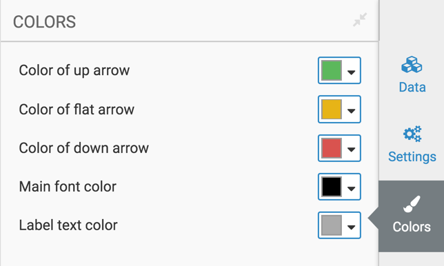
To choose a different color for the up arrow of the visual (the relative difference between the main value and the compare value), make changes in the Color of up arrow selector. You can select one of the palette colors, or specify a custom color.
To choose a different color for the flat arrow of the visual (when there is no difference between the main and comparison values), make changes in the Color of flat arrow selector. You can select one of the palette colors, or specify a custom color.
To choose a different color for the up arrow of the visual (the relative difference between the main value and the compare value), make changes in the Color of down arrow selector. You can select one of the palette colors, or specify a custom color.
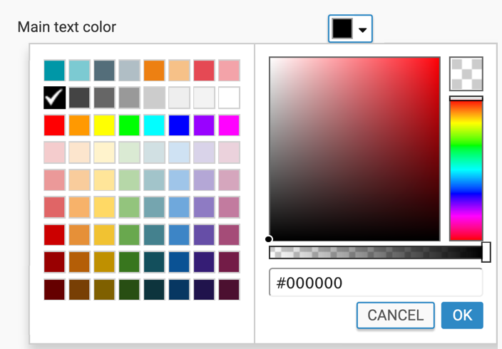
To choose a different color for the font of the main measure of the visual, make changes in the Main text color selector. You can select one of the palette colors, or specify a custom color.
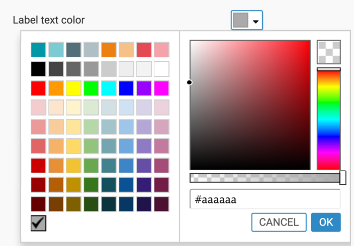
To choose a different color for the font of the label of the visual, make changes in the Label text color selector. You can select one of the palette colors, or specify a custom color.