Cloudera Data Visualization enables you to create Packed Bubbles
visuals.
Packed Bubbles visuals compare the relative values in close physical proximity. Two main
series of data are used: the field on the Dimensions shelf names the
bubble and the field on the Measures shelf determines the relative
area of the bubble.
This is different from the traditional approach, where bubbles represent three dimensions
of data — one each for horizontal and vertical axes, and one for the area of bubble. This
type of visualization is part of flexibility built into Scatter visuals available in Cloudera Data Visualization.
The following steps demonstrate how to create a new Packed Bubbles visual on the
World Life Expectancy dataset [data source
samples.world_life_expectancy]. For an overview of shelves that specify
this visual, see Shelves for packed bubbles visuals.
Start a new visual based on the World Life Expectancy dataset.
For instructions, see Creating a visual.
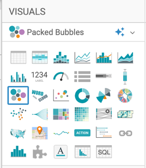
In the VISUALS menu, find and click Packed
Bubbles.
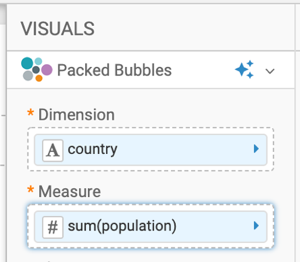
The shelves of the visual changed.
They are now Dimension,
Measure, Color,
Tooltips, X Trellis, Y
Trellis, and Filters.
Both
Dimension and Measure are
mandatory.
Populate the shelves from the available fields (Dimensions,
Measures) in the DATA menu.
Under Dimensions, select country and drag
it to the Dimension shelf.
Under Measures, select population and drag
it to the Measure shelf.
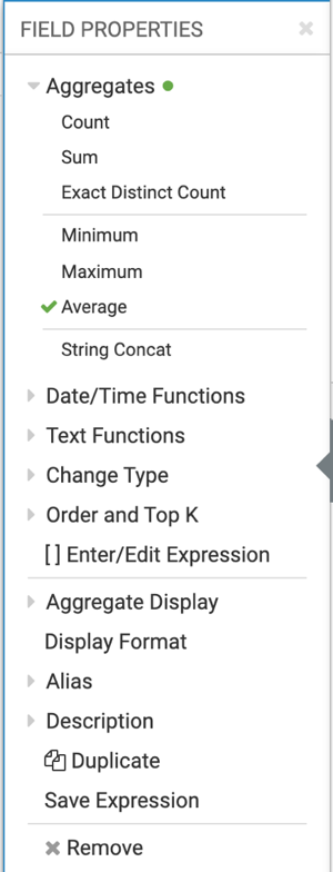
Change the aggregate of the population field from
sum(population) to avg(population):
On the shelf of the visual, click the caret-right icon to
the right of the field.
In the FIELD PROPERTIES menu, click Aggregates > Average.
Click the x icon at the top of the Column
Properties menu to close it.
Click REFRESH VISUAL.
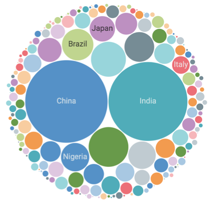
The Packed Bubbles visual appears.
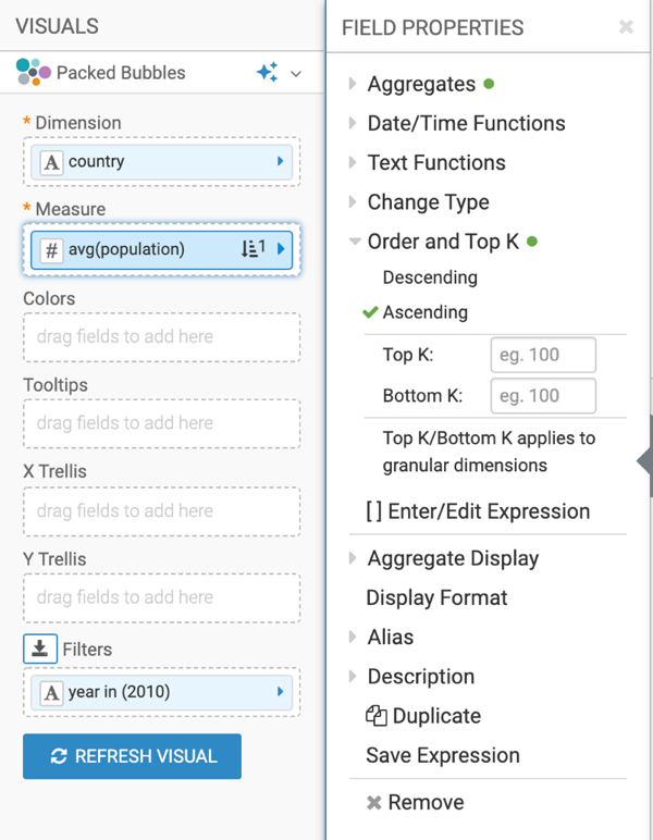
On the Filters shelf, add further
Dimensions and Measures from the
DATA menu.
This enables you to dynamically control the data input, and discover the data at a more
granular level.
For example, from Dimensions, drag year to the
Filters shelf.
On the Filter shelf, click the (down
arrow) icon on the year field, and select Pick
values from a list.
The Filter for year modal window appears.
In the Values tab, select 2010, and click
APPLY.
On the Measures shelf, click the (down arrow)
icon on the avg(population) field, select Order
and Top K, and select Ascending.
Click REFRESH VISUAL to see the updated Packed Bubbles
chart.
Click the pencil/edit icon next to the title of the
visualization to enter a name for the visual.
In this example, the title is changed to 'World Population - Packed Bubbles'. You can
also add a brief description of the visual as a subtitle below the title of the
visualization.
At the top left corner of the Dashboard Designer, click
SAVE.
We want your opinion
How can we improve this page?
What kind of feedback do you have?
This site uses cookies and related technologies, as described in our privacy policy, for purposes that may include site operation, analytics, enhanced user experience, or advertising. You may choose to consent to our use of these technologies, or